Drawing ASCII bar charts
When I’m writing scripts, I often have some tabular data that I need to present. This data might show the number of website hits per day, or which pages had the most errors. Here’s an example of the sort of tabular data I mean:
data = [
    ('Clare',            64),
    ('Donegal',          48),
    ('Mayo',             57),
    ('Meath',            67),
    ('Offaly',           58),
    ('Tipperary',        59),
    ('Wicklow',          74),
]
I want to print it in a way that’s easy for me to read, and makes the trends stand out. It’s hard to get a sense of the overall picture without reading the individual numbers – I’d much rather have a bar chart.
If I was being fancy, I could use matplotlib and draw a graphical chart – but if I’m running a shell script in the terminal, it’s not always convenient to display images. I’d rather print something I can view in my terminal – an ASCII bar chart.
There are probably libraries that can do this for you, but I found it simpler to write my own snippet to draw bar charts.
Like so:
max_value = max(count for _, count in data)
increment = max_value / 25

longest_label_length = max(len(label) for label, _ in data)

for label, count in data:

    # The ASCII block elements come in chunks of 8, so we work out how
    # many fractions of 8 we need.
    # https://en.wikipedia.org/wiki/Block_Elements
    bar_chunks, remainder = divmod(int(count * 8 / increment), 8)

    # First draw the full width chunks
    bar = '█' * bar_chunks

    # Then add the fractional part.  The Unicode code points for
    # block elements are (8/8), (7/8), (6/8), ... , so we need to
    # work backwards.
    if remainder > 0:
        bar += chr(ord('█') + (8 - remainder))

    # If the bar is empty, add a left one-eighth block
    bar = bar or  '▏'

    print(f'{label.rjust(longest_label_length)} ▏ {count:#4d} {bar}')
It gets the maximum value from the data set, and uses that to decide how wide one chunk of the bar is. Then it gets the longest label, which is used for padding the labels to align correctly.
Drawing the bars is moderately involved – there are Unicode block elements that come in eighths of a block, so I use a full-width block for most of the bar and a fractional block for the remainder. (Some monospaced fonts screw up the fractional blocks, in which case it’s easiest just to drop that bit.)
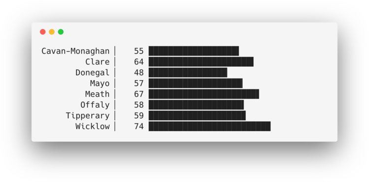
The output looks something like this:
Cavan-Monaghan ▏   55 ██████████████████▌
         Clare ▏   64 █████████████████████▌
       Donegal ▏   48 ████████████████▏
          Mayo ▏   57 ███████████████████▎
         Meath ▏   67 ██████████████████████▋
        Offaly ▏   58 ███████████████████▌
     Tipperary ▏   59 ███████████████████▉
       Wicklow ▏   74 █████████████████████████
Or if it isn’t displaying correctly in your web browser, here’s a screenshot:
It won’t win any prizes for data visualisation, but I do find it a useful way to get a quick glance at some data without leaving my terminal.