Creating a “simple” three-up image layout in CSS
I’ve been toying with a new layout for an upcoming post: a three-up display of images, with one big image on the left and two smaller images on the right. I wanted something a bit more visually interesting than a scrolling vertical list. This is the sort of thing I mean:

If you’ve done a lot of front-end web development, this sort of thing probably seems quite easy – I’ve seen websites with much more complex layouts.
But I don’t do much front-end work, so I wasn’t sure how to go about this. It took a lot of experimentation and research to get something I was happy with – so let’s walk through it together.
Step 1: Get on the grid
Although I don’t do much front-end development, I am vaguely aware of CSS Grid. I know it’s the “new” approach to doing complex layouts, and I’ve dabbled with it for a few projects. (I put “new” in air quotes because it’s been around for years, but I’m only just starting to use it.)
Here’s a simple three-cell grid using divs:
<div class="grid">
  <div class="item left">left grid item</div>
  <div class="item upper_right">upper right grid item</div>
  <div class="item lower_right">lower right grid item</div>
</div>
and the CSS that matches it:
.grid {
  display: grid;
  grid-template-columns: calc(66% - 5px) calc(34% - 5px);
  grid-template-rows:    calc(50% - 5px) calc(50% - 5px);
  grid-gap: 10px;
}

.grid .left_image {
  grid-column: 1 / 2;
  grid-row: 1 / span 2;
  /* equivalent to:
  grid-row-start: 1;
  grid-row-end: 2;
  */
}

.grid .right_upper_image {
  grid-column: 2 / 2;
  grid-row: 1 / 2;
}

.grid .right_lower_image {
  grid-column: 2 / 2;
  grid-row: 2 / 2;
}
The display: grid; property switches the div into grid mode, and the -template-columns and -template-rows properties tell the grid how tall/wide the columns and rows should be.
I’m using percentages of the width/height of the overall grid, then subtracting 5 pixels to account for the grid spacing. I want the rows to be equal height, and the first column to be twice as wide as the second. There are lots of ways to define these sizes and this may not be optimal, but it makes sense to me. I did try using the fr unit, which is the fraction of flexible space – but I ran into some weird issues when the content of the grid items overflowed, so I gave up.
The grid-row and grid-column properties on individual items tell them where to sit in the grid. For the item on the left-hand side, the 1 / span 2 value tells it to start in row 1 and fill 2 rows.
This is what it looks like. I’ve added some background colours so the different items stand out:
This looks a bit like what I want!
At this point I could use the background-image property on the divs to get images into the layout, and call it a day – but I don’t like that approach. Among other reasons, there’s no way to specify alt text on background images, and screen readers will ignore them. Maybe I could hack something into a div, but it feels like swimming against the tide. I wanted to find a way to use <img> tags, because they’re more semantically appropriate and they’re more accessible.
Step 2: Adding images to the grid
Let’s start by just dropping the images into the grid, and see what happens:
<div class="grid">
<div class="item left">
<img src="/night_sky.jpg">
</div>
<div class="item upper_right">
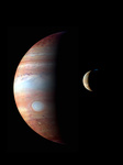
<img src="/jupiter.jpg">
</div>
<div class="item lower_right">
<img src="/iss.jpg">
</div>
</div>


This gets the images in the right place, but they’re the wrong sizes – they’ve overflowing out of the grid. How do we make them fit?
(As a sidebar: I vaguely wonder if there’s a way to make the images the grid items and bypass a layer of <div>s, but I haven’t found anything that works.)
Step 3: Set the width and height of the images
We can tell the images to completely fill the grid items by setting width and height properties, but it’s a bit crude:
.grid .item img {
  width:  100%;
  height: 100%;
}
The percentage values are relative to the containing element – in this case, the grid items that were coloured red/green/blue. This gets us flush edges, but now the images have been distorted – they’ve been stretched to fill the container. (Notice how Jupiter has become much less circular.)
If I was making this layout in a graphics editor, I’d expand the images while maintaining the aspect ratio, then crop them to fit. Can we achieve that with CSS?
Step 4: Add the object-fit property
To unbreak the aspect ratio, I discovered a new-to-me CSS property: object-fit. This defines how an element (say, an image or video) should be resized to fit into a container.
The default value is object-fit: fill, which expands the element to completely fill the container, and stretches the object to fit, ignoring the original aspect ratio. That’s what’s causing the distortion in the example above.
After experimenting with the other values (I had to try it myself to really understand how they worked), I think the value I want is object-fit: cover. This expands an element while maintaining its aspect ratio, and if it doesn’t fit perfectly then extra bits get clipped out – the edges of the image get cropped. That’s what I’d do if I was making this layout by hand!
Let’s add that CSS rule:
.grid .item img {
  object-fit: cover;
}
Now the edges of the images are being cropped out (for example, we can’t see the solar panels on the ISS), but they’re no longer being distorted. Hopefully there’s nothing important in the edges, but there’s an object-position property that lets me choose exactly how to fit the image into the crop if the default isn’t quite right.
When I have large images in a post, I usually embed a smaller thumbnail which links to the full resolution image. That’s another reason not to worry too much about cropping around the edges – if somebody really wants to see all the detail, they can follow the link.
This is pretty close to what I want; the last thing I want to tweak is the overall aspect ratio.
Step 5: Setting the aspect ratio
The last time I looked at setting an aspect ratio in CSS, there were weird tricks with padding and positioning that I didn’t really understand. I was expecting to use this work to learn about that properly, and really wrap my head around it – but it turns out, I don’t need to.
There’s another CSS property called aspect-ratio which lets you set a preferred aspect ratio for a container. If you add this property, you can change the size of the overall grid; for example:
.grid {
  aspect-ratio: 16 / 9;
}
This is a new-ish property that only started appearing in browsers about a year or so ago, and I don’t have a good sense for when it’s safe to adopt new CSS. Can I use says it’s supported by about 84% of users, which feels a bit low – and skimming Twitter shows mixed opinions on whether it’s safe to use, or whether you still need a fallback.
Because this is only for my blog posts, I’m going to save myself a padding palaver and use aspect-ratio. If I was working on a larger website with more visitors, I might make a different decision.
Putting it all together
This is what my new component looks like:
<div class="grid">
  <div class="item left">
    <img src="/night_sky.jpg">
  </div>
  <div class="item upper_right">
    <img src="/jupiter.jpg">
  </div>
  <div class="item lower_right">
    <img src="/iss.jpg">
  </div>
</div>
.grid {
  display: grid;
  grid-template-columns: calc(66% - 5px) calc(34% - 5px);
  grid-template-rows:    calc(50% - 5px) calc(50% - 5px);
  grid-gap: 10px;
  aspect-ratio: 16 / 9;
}

.grid .left {
  grid-column: 1 / 2;
  grid-row:    1 / span 2;
}

.grid .upper_right {
  grid-column: 2 / 2;
  grid-row:    1 / 2;
}

.grid .lower_right {
  grid-column: 2 / 2;
  grid-row:    2 / 2;
}

.grid .item img {
  width:  100%;
  height: 100%;
  object-fit: cover;
}
I have an image layout that does what I want, and more importantly, that I understand. I know how it works, and I’ll know how to change it if I want to tweak something later. There are lots of snippets that I could have mindlessly copied, but I know how this works.
This step-by-step breakdown is pretty close to how I actually built the layout. I created an empty HTML file and started writing. Every time I made progress, I copied the file and started working on the copy – so I could try new things without losing what I’d already achieved. I’ve removed a few dead ends and tidied up the examples, but otherwise the post is pretty close to those original files.
Writing it all out in this post helped cement my understanding – although I struggled to get it working, now I’ve written detailed explanations I think I’ll be able to remember it.
It’s been a long time since you could “View Source” on a web page and reliably get comprehensible HTML, but I’ve always liked that idea and tried to preserve it on this site. These layouts will let me keep doing that.