Getting blink diffs for photos on the iPad
When I’m taking a photo, I like to take several shots every time. This is pretty common photography advice: it means you’re more likely to get at least one good shot. But it also means my library is full of fuzzy or repetitive photos, and I like to clean them up.
When I’m reviewing my photos, I like to use “blink diffs”. You switch rapidly between two similar images, and the back-and-forth helps you spot the difference. The name comes from astronomy, and astronomers would use this technique to spot moving objects in pictures of the night sky. I do blink diffs between my similar shots, and I only keep the best one.
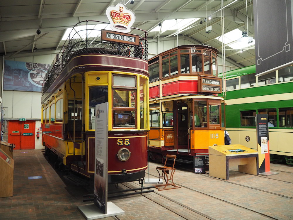
You can try a simple blink diff by tapping the image below: you’ll switch between three slightly different shots of the same tram.
If I’m using the Photos app on my Mac, I can switch between photos using the arrow keys – but I don’t really want to manage photos on a computer. Sitting at my computer feels like work; sorting through photos is a more casual task. For a long time, I’ve wanted to browse my photos from a comfy chair with my iPad – it’s the sort of task the iPad should be good at.
Unfortunately, the built-in Photos app doesn’t have a way to do the instant switching that I want.
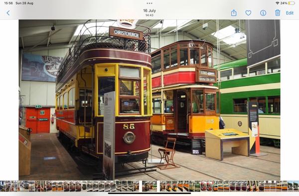
If I want to move to the next photo, I can swipe left or right – but this does a full-screen animation, where the current photo gets “pushed” off the screen by the new photo. The motion and the delay makes it much harder to compare photos.
I could also select a photo using the carousel of thumbnails at the bottom of the screen, which does switch straight to the chosen photo – but they’re very small. On my iPad, they’re 21 × 42 points, less than half the recommended size for tap targets in Apple’s Human Interface Guidelines. I struggle to hit them reliably.
Then I heard about an app called Darkroom, and in particular its workflow for reviewing photos. I liked it almost immediately, because it makes it much easier to switch between photos without an intermediate animation. This is what it looks like:
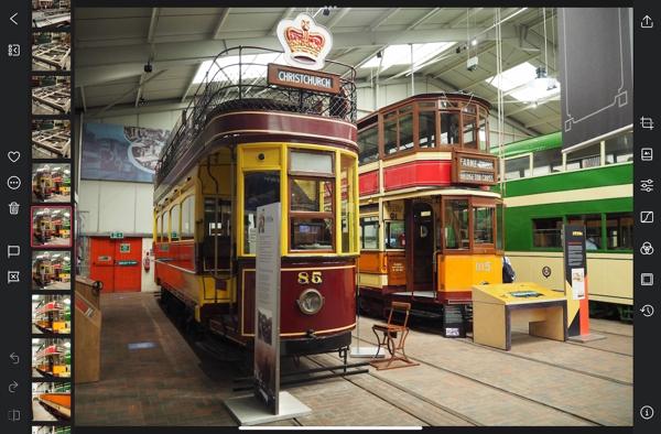
There’s a carousel of thumbnails down the left-hand side (where I already have a hand holding the iPad), and the thumbnails are much bigger – almost 5x more space than in the built-in app. If I tap a thumbnail, it instantly switches to that photo.
This app has way more features that I have yet to explore, but this alone will make me a paid subscriber. I’d actually been thinking of building this sort of instant-switching photo browser myself (and I had a very early prototype), but now I don’t have to.