Doodling with the Mac’s command icon
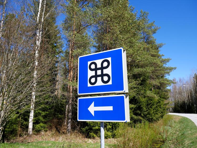
The command key (⌘) has been a ubiquitious part of the Mac for over forty years. It was chosen by legendary icon designer Susan Kare, who picked it from a symbol dictionary – this shape was already being used in Sweden to highlight an interesting feature on a map. It’s an abstract and pleasant shape, and can still be seen today on road signs and keyboards alike.
I spend a lot of time doodling shapes that look like the command icon. The original shape is quite easy to draw, and then I try variations like making the loops bigger or smaller, or changing the number of loops in the shape. While I’ve been bored and had a pen and paper, I’ve drawn dozens of little looped squares.
But part of the beauty of this symbol is the rotational symmetry, and that’s hard to capture that consistency in a free-hand sketch – at least one of my loops or lines would look different to the others. But computers are very good at drawing repetitive, symmetric shapes, so I wanted to see if I could draw the command icon and its variants in SVG.
I started with Susan Kare’s original pixel icon from System 1.0, and I tried to recreate that as an SVG path. I had to re-read the MDN tutorial on SVG arcs several times, but I did manage to write a <path> that reproduces the original icon as a smooth curve:
This was fairly simple, because I can match the coordinates in the pixel version to the curves I’m trying to draw. The 4-way symmetry and right angles make the geometries quite simple.
What if I wanted to do something more complicated, like vary the number of loops or increase the distance between them? That’s harder to write by hand, so I wanted to do that programatically. It required a bit of trigonometry, but I was able to get some working code.
Despite this simple starting point, I was able to get quite a variety of shapes:
Keep reading to find out how I made these pictures, and how you can make your own.
The idea
One way to imagine the macOS Command icon is being made of multiple “looped hooks”.
If you take a collection of these, rotate them around a central point, and join them together, you’d get the complete shape.
There are three variables we can change:
- How many sides/loops are there in the shape?
- How long are the straight edges?
- How big are the circular loops?
Let’s work out how to draw one of these hooks given these inputs.
Tackling the trigonometry
This next section features a walkthrough of the trigonometry involved in drawing these hook shapes. It’s not 100% rigorous, but it’s the bit I find most interesting and it would feel like cheating if I didn’t even try to explain this – but if trig isn’t your cup of tea, you can skip to the pretty pictures.
Let’s start by considering the straight line, up to the loop. This is the part I’m thinking about:
We know the length of this line (which I’ll denote $L$) and the number of sides. Let’s assume we also know the centre of rotation, which I’ll mark with a blue circle. We need to work out the coordinates of the start and end points of this line, which I’ll mark with blue dots.
The interesting variable here is $h$, because we can use it to define the start/end points of the line:
$$ \begin{align} \text{start} &= (\text{centre}_x - L/2, \text{centre}_y - h) \[2pt] \text{end} &= (\text{centre}_x + L/2, \text{centre}_y - h) \end{align} $$
How can we work out the angle $\theta$? Notice that in the final shape, these line segments form a regular polygon:
The angles around a point sum to $360^\circ$, and this angle will be the same for every side (by rotational symmetry), so we can calculate $\theta$:
$$ \theta = \frac{360^\circ}{\text{number of sides}} $$
Using some right-angled triangle geometry, we can then work out the height $h$:
$$ h = \frac{L}{2\tan(\theta/2)} $$
The SVG syntax for drawing this line is then
<path d="M {start_x} {start_y} L {end_x} {end_y}"/>Next, let’s think about the curved loops. We know the number of sides and the radius of each loop (denoted $r$). We need to work out where the circular arc starts and where it ends. There are two unknowns here: the angle swept out by the loop (denoted $\psi$) and the length of the straight line segment before the circular arc starts (denoted $s$).
First let’s work out the angle $\psi$. Let’s sketch out a bit more of the overall shape:
The angle I’ve marked $\varphi$ is one of the interior angles of the regular polygon created by the line segments, and we can work out the interior angle of such a polygon:
$$ \varphi = \frac{180^\circ \times \left(\text{number of sides} - 2\right)}{\text{number of sides}} = 180^\circ \left(1 - \frac{2}{\text{number of sides}}\right) $$
Then a bit more straight line geometry and the interior angles of the kite (the line segments are at right angles to the radii, to give a smooth transition from circular arc to straight line) allow us to work out the angle $\psi$:
$$ \psi = 180^\circ + \varphi = 360^\circ \left(1 - \frac{1}{\text{number of sides}}\right) $$
We can then work out the length $s$ using some trigonometry:
$$ s = r \tan\left(\frac{360^\circ - \psi}{2}\right) = r \tan\left(\frac{180^\circ}{\text{number of sides}}\right) $$
Then we can work out the centre of the circular arc:
$$ \text{centre of arc} = (\text{start of loop}_x + s, \text{start of loop}_y - r) $$
And from this we can get the start and finish points of the circular arc:
The SVG syntax for drawing this circular arc is then
<path d="M {start_x} {start_y} A {r} {r} 0 1 0 {end_x} {end_y}"/>The 0 1 0 are part of the SVG arc syntax. The first 0 is x-axis-rotation, which we leave at the default. Then we have to choose between the four possible arcs that connect the start/end points: in this case large-arc-flag = 1 and sweep-flag = 0 give us the arc we need.
Finally, let’s work out the centre of rotation. Everything is defined in relation to this point. Intuitively we’re going to put it in the middle of our SVG canvas, but how big should that canvas be? This depends on how large our straight lines and circular arcs are going to be, because bigger shapes need more space.
So let’s ask a different question: what’s the furthest point on the shape from the centre of rotation?
You can find this point by drawing a line from the centre of rotation to the centre of the circular arc, and then continuing until it intersects the arc:
Why is this the furthest point? Let’s consider the alternatives. If you’re at any point on the line, you can get further away from the centre by moving toward one of the ends. If you’re at the end of the line, you can get further away by moving along the circular arc. If you’re at any other point on the circular arc, you’re closer to the centre of rotation than this intersection point (using the triangle inequality).
Pythagoras’ theorem gets us the distance to the center of the circle, and then we add on the radius. This means the further point from the centre of rotation is:
$$ \text{max distance} = r + \sqrt{(L/2 + s)^2 + (h+r)^2} $$
Let’s double that and add some padding, and use that as the width/height of our SVG canvas. This should give us enough space to draw our shape.
It took a while to work this all out, and iron out my silly mistakes, but it paid off when I was implementing the final version in code. I wasn’t trying to write code and do geometry at the same time – I could just take the already solved geometry problem, and translate the solution into JavaScript. It would have been harder to get right if I was trying to implement an incomplete idea.
Projects like this are where plain text feels really limiting as a medium for source code. I’d love to be able to include formulas and small sketches to explain what I’m doing, because often they’re much clearer than a wall of text.
From equations to XML
The idea behind the maths is that we create a single loop shape, and then repeat it as many times as we need. We can replicate this idea in SVG, by defining the shape of the loop as an identified <path> element, then reusing that by calling <use> with a rotation transformation.
Here’s a template for what the SVG looks like:
<svg viewBox="0 0 {width} {height}" xmlns="http://www.w3.org/2000/svg">
  <defs>
    <style>
      path {
        stroke: black;
        stroke-width: 1px;
        fill: none;
      }
    </style>

    <path id="loopedHook"
      d="
        M ${start of line}
        L ${end of line}
        L ${start of arc}
        A ${radiusOfLoop} ${radiusOfLoop}
        0 1 0
        ${end of arc}
        L ${end of loop}
        "/>
  </defs>

  <use href="#loopedHook" transform="rotate({0 * angle}, {centre of rotation})" />
  <use href="#loopedHook" transform="rotate({1 * angle}, {centre of rotation})" />
  …
  <use href="#loopedHook" transform="rotate({N * angle}, {centre of rotation})" />
</svg>
At last, some pretty pictures
With all the geometry and programming done, I was able to implement this in JavaScript. Drawing inspiration from another bit of Apple history, I made a web app where you can change the variables, and it redraws the shape for you. I also included a colour picker and rotation, which adds a bit more variety and visual interest.
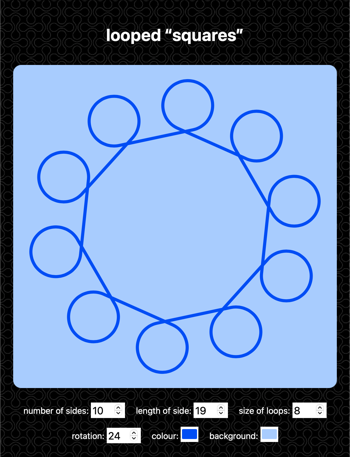
Every time you reload the page, it draws a shape with random values. You can also adjust the values manually and it’ll draw the specified shape. Try it here.
I started by drawing a couple of shapes which look like alien versions of the Mac’s command icon:
You can create more interesting shapes when you let the loops start to overlap – by cranking down the length of the straight edges, and cranking up the radius of the loops.
They get particularly fun as you make the length of the straight edge very small:
At some point I tried setting a negative length. This makes no sense mathematically, but the computer is happy to plug it into the formulas and draw a shape anyway. Some of these still bear a resemblance to the original icon, but others are getting further away – in particular the straight edges on the outside are a new feature.
This naturally led me to consider setting a negative radius as well as a negative length. These weren’t quite as interesting – in many cases the two negatives cancelled each other out – but when I made the radius large and negative, I did get a few fun examples where the diagram has negative space in the middle:
What’s actually happening here is that the shape extends beyond the expected boundary of the canvas – there’s still a big circular symbol around it, but we’re only seeing the centre.
And finally, here’s the blooper reel for this post. It took a while to get all the maths right, and make sure I hadn’t flipped a sign somewhere or made a simple logic error. Sometimes the most interesting pictures are the ones I made by mistake:
This variety is one of the things I enjoy about generative art: I can start with a simple idea or doodle, and create a whole variety of shapes and pictures. Many of these I wouldn’t know how to draw if I started from a blank sheet of paper, but here I just stumbled into them.
If you want to create some of these shapes yourself, the web app is available at alexwlchan.net/fun-stuff/looped-squares/. Send me your favourites!
If you like this post, you might want to check out my other generative art.