My favourite websites from my bookmark collection
Over the last three weeks, I’ve been writing about how I manage my bookmarks. how I use a static site to store them, how I built a personal web archive by hand, and what I learnt about web development along the way.
I wanted to end this series on a lighter note, so here’s a handful of my favorite sites I rediscovered while reviewing my bookmarks – fun, creative corners of the web that make me smile.
This article is the final part of a four part bookmarking mini-series:
- Creating a static site for all my bookmarks – why I bookmark, why I use a static site, and how it works.
- Building a personal archive of the web, the slow way – how I built a web archive by hand, the tradeoffs between manual and automated archiving, and what I learnt about preserving the web.
- What I learnt about making websites by reading two thousand web pages – how to write thoughtful HTML, new-to-me features of CSS, and some quirks and relics I found while building my personal web archive.
- My favourite websites from my bookmark collection (this article) – websites that change randomly, that mirror the real world, or even follow the moon and the sun, plus my all-time favourite website design.
The ever-changing “planets” of kottke.org
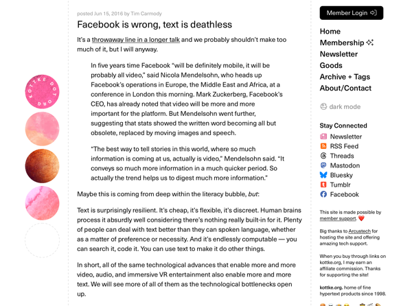
Jason Kottke’s website, kottke.org, has a sidebar that shows four coloured circles, different for every visitor. There are nearly a trillion possible combinations, which means everyone gets their own unique version of the page.

I think this adds a dash of fun whimsy, and I’ve tried adding something similar to my own sites, but it’s easy to get wrong. My experiments in randomness often failed because they lacked constraints – for example, I’d pick random tint colours, but some combinations were unreadable. The Kottke “planets” strike a nice balance: the randomness stands out, but it’s reined in so the overall page will always look good.
There are thousands of snapshots of kottke.org in the Wayback Machine, many saved automatically. That means there are unique combinations of circles already archived that have yet to be seen by a person – frozen moments that may only be seen by a future reader, long after this design has gone. I rather like that: a tiny, quiet, time capsule on the web.
Physical meets digital on panic.org
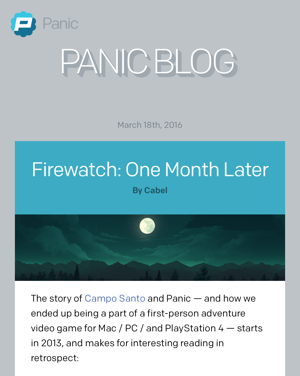
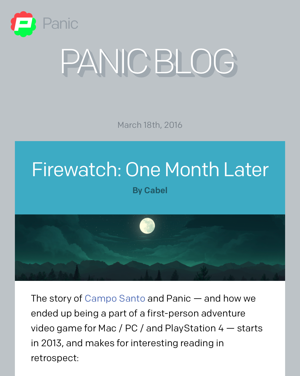
The software company Panic has a circular logo: a stylised “P” on a two-tone blue background. But for years, if you visited their website, you might see that logo in a different colour, like this:


Where did those colours come from? The logo image gets loaded from signserver.panic.com, which makes me think it reflected the current colours of the physical sign on their building. They even had a website where anybody could change the colours of the sign (though it’s offline now – they took the sign down when they moved offices).
I love this detail: a tiny bit of the physical world seeping into the digital.
A Tumblr theme that follows the sun
Another instance of the physical world affecting the digital comes from one of my bookmarked Tumblr posts, which has a remarkable theme Circadium 2.0, made by Tumblr user Laighlin. Forget a binary switch between light and dark mode, this is a theme that slowly changes the appearance through the entire day.
The background changes colour, stars fade in and out, and the moon and the sun gradually rise and set. It cycles through noon, twilight, and dusk, before starting the same thing over again. It’s hard to describe it in words, so here’s a screen recording of the demo site for a 24 hour cycle:
This effect is very subtle, because the appearance is set based on the time you loaded the page, and doesn’t change after that. Unless you reload the same page repeatedly, you may even not notice the background is changing.
This is the sort of creativity I love about sites like Tumblr and LiveJournal, where users can really customise the appearance of their sites – not just pick a profile picture and a tint colour.
Subtle transitions at Campo Santo
The Campo Santo blog has a more restrained design, but still makes fun use of shifting colours – the tint colour of the page gradually switches from a reddish orange to brown, to green, to a dark yellow, and back to orange. This tint colour affects multiple elements on the page: the header, the sidebar promo, headings and social media links.
Here’s what it looks like:
Sadly, this animation only lives on in web archives and in memory – something has broken in the JavaScript that means it no longer works on the live site. The fragility of the web isn’t just entire pages or sites going offline, it’s also the gradual breaking of pages that remain online.
The hand-drawn aesthetic of Owltastic
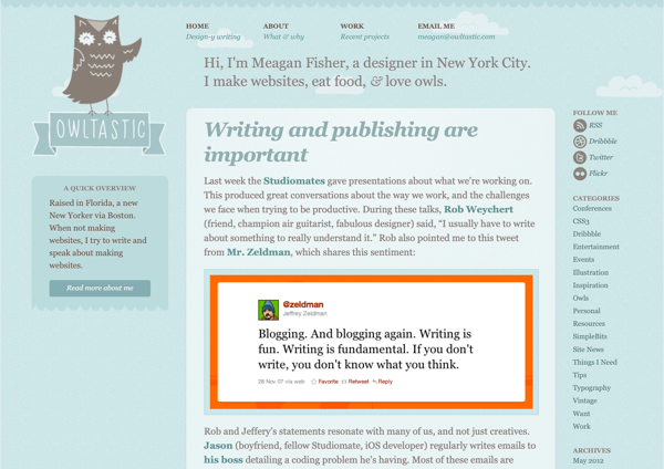
My favourite website is the old design of Meagan Fisher Couldwell’s website. It has a beautiful, hand-drawn aesthetic, and it’s full of subtle texture and round corners – no straight lines, no hard edges. It has a soft and gentle appearance, and a friendly owl mascot to boot.
I bookmarked this particular page in 2013, before iOS 7 when loud textures and skeuomorphism were still in fashion – but unlike many designs from that era which now look dated, I think this site still looks good today.

Owltastic is the first site I remember seeing and thinking “wow”, and wanting to build something that looked that good. Meagan has since redesigned her site, but I have a lot of nostalgia for that hand-drawn look.
Final thoughts
A lot of the creativity has been squeezed out of the web. I’ve been working on a separate social media archiving project recently, and it’s depressing how many sites look essentially the same – black sans serif text on a white background. (Many of them even use the default system font, because heaven forbid a site have any personality.)
Going through my bookmarks has been a fun reminder that the web is still a creative, colourful, and diverse space – the variety is there, even if it’s getting harder to find. Lots of people are doing interesting stuff on the web, and my bookmarks are a way to remember and celebrate that.
Revamping the way I organise my bookmarks has taken a lot of work, but I’m so pleased with the result. Now I have a list of my most important web pages in an open format, saved locally, with an archived copy of each page as well. I can browse them in a simple web interface, and see every page as I remember it, even if the original website has disappeared.
I don’t like making predictions, but this feels like a system that should last a long time. There are no third-party dependencies, nothing that will need upgrading, no external service that could be abandoned or enshittified. I feel like I could manage my bookmarks this way for the rest of my life – stay tuned to see if that holds true!
Writing this four-part series has been the capstone to this year-long project. I had a lot of time to think about bookmarks and web archiving, and I didn’t want those thoughts to disappear. I hope you’ve enjoyed it, and that I’ve given you some new ideas. Thank you for reading this far.
My favourite parts of the web are the spaces where people share interesting ideas. This mini-series – and this entire blog – is my contribution to that collective work.