Creating static map images with OpenStreetMap, Web Mercator, and Pillow
I’ve been working on a project where I need to plot points on a map. I don’t need an interactive or dynamic visualisation – just a static map with coloured dots for each coordinate.
I’ve created maps on the web using Leaflet.js, which load map data from OpenStreetMap (OSM) and support zooming and panning – but for this project, I want a standalone image rather than something I embed in a web page. I want to put in coordinates, and get a PNG image back.
This feels like it should be straightforward. There are lots of Python libraries for data visualisation, but it’s not an area I’ve ever explored in detail. I don’t know how to use these libraries, and despite trying I couldn’t work out how to accomplish this seemingly simple task. I made several attempts with libraries like matplotlib and plotly, but I felt like I was fighting the tools. Rather than persist, I wrote my own solution with “lower level” tools.
The key was a page on the OpenStreetMap wiki explaining how to convert lat/lon coordinates into the pixel system used by OSM tiles.
In particular, it allowed me to break the process into two steps:
- Get a “base map” image that covers the entire world
- Convert lat/lon coordinates into xy coordinates that can be overlaid on this image
Let’s go through those steps.
Get a “base map” image that covers the entire world
Let’s talk about how OpenStreetMap works, and in particular their image tiles. If you start at the most zoomed-out level, OSM represents the entire world with a single 256×256 pixel square. This is the Web Mercator projection, and you don’t get much detail – just a rough outline of the world.

We can zoom in, and this tile splits into four new tiles of the same size. There are twice as many pixels along each edge, and each tile has more detail. Notice that country boundaries are visible now, but we can’t see any names yet.
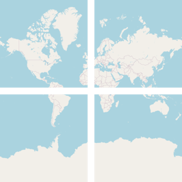
We can zoom in even further, and each of these tiles split again. There still aren’t any text labels, but the map is getting more detailed and we can see small features that weren’t visible before.
You get the idea – we could keep zooming, and we’d get more and more tiles, each with more detail. This tile system means you can get detailed information for a specific area, without loading the entire world. For example, if I’m looking at street information in Britain, I only need the detailed tiles for that part of the world. I don’t need the detailed tiles for Bolivia at the same time.
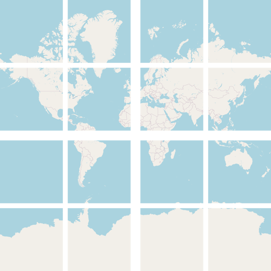
OpenStreetMap will only give you 256×256 pixels at a time, but we can download every tile and stitch them together, one-by-one.
Here’s a Python script that enumerates all the tiles at a particular zoom level, downloads them, and uses the Pillow library to combine them into a single large image:
#!/usr/bin/env python3
"""
Download all the map tiles for a particular zoom level from OpenStreetMap,
and stitch them into a single image.
"""

import io
import itertools

import httpx
from PIL import Image


zoom_level = 2

width = 256 * 2**zoom_level
height = 256 * (2**zoom_level)

im = Image.new("RGB", (width, height))

for x, y in itertools.product(range(2**zoom_level), range(2**zoom_level)):
    resp = httpx.get(f"https://tile.openstreetmap.org/{zoom_level}/{x}/{y}.png", timeout=50)
    resp.raise_for_status()

    im_buffer = Image.open(io.BytesIO(resp.content))

    im.paste(im_buffer, (x * 256, y * 256))

out_path = f"map_{zoom_level}.png"
im.save(out_path)
print(out_path)
The higher the zoom level, the more tiles you need to download, and the larger the final image will be. I ran this script up to zoom level 6, and this is the size of the data:
| Zoom level | Number of tiles | Pixels | File size |
|---|---|---|---|
| 0 | 1 | 256×256 | 17.1 kB |
| 1 | 4 | 512×512 | 56.3 kB |
| 2 | 16 | 1024×1024 | 155.2 kB |
| 3 | 64 | 2048×2048 | 506.4 kB |
| 4 | 256 | 4096×4096 | 2.7 MB |
| 5 | 1,024 | 8192×8192 | 13.9 MB |
| 6 | 4,096 | 16384×16384 | 46.1 MB |
I can just about open that zoom level 6 image on my computer, but it’s struggling. I didn’t try opening zoom level 7 – that includes 16,384 tiles, and I’d probably run out of memory.
For most static images, zoom level 3 or 4 should be sufficient – I ended up a base map from zoom level 4 for my project. It takes a minute or so to download all the tiles from OpenStreetMap, but you only need to request it once, and then you have a static image you can use again and again.
This is a particularly good approach if you want to draw a lot of maps. OpenStreetMap is provided for free, and we want to be a respectful user of the service. Downloading all the map tiles once is more efficient than making repeated requests for the same data.
Overlay lat/lon coordinates on this base map
Now we have an image with a map of the whole world, we need to overlay our lat/lon coordinates as points on this map.
I found instructions on the OpenStreetMap wiki which explain how to convert GPS coordinates into a position on the unit square, which we can in turn add to our map. They outline a straightforward algorithm, which I implemented in Python:
import math


def convert_gps_coordinates_to_unit_xy(
    *, latitude: float, longitude: float
) -> tuple[float, float]:
    """
    Convert GPS coordinates to positions on the unit square, which
    can be plotted on a Web Mercator projection of the world.

    This expects the coordinates to be specified in **degrees**.

    The result will be (x, y) coordinates:

    -   x will fall in the range (0, 1).
        x=0 is the left (180° west) edge of the map.
        x=1 is the right (180° east) edge of the map.
        x=0.5 is the middle, the prime meridian.

    -   y will fall in the range (0, 1).
        y=0 is the top (north) edge of the map, at 85.0511 °N.
        y=1 is the bottom (south) edge of the map, at 85.0511 °S.
        y=0.5 is the middle, the equator.

    """
    # This is based on instructions from the OpenStreetMap Wiki:
    # https://wiki.openstreetmap.org/wiki/Slippy_map_tilenames#Example:_Convert_a_GPS_coordinate_to_a_pixel_position_in_a_Web_Mercator_tile
    # (Retrieved 16 January 2025)

    # Convert the coordinate to the Web Mercator projection
    # (https://epsg.io/3857)
    #
    # x = longitude
    # y = arsinh(tan(latitude))
    #
    x_webm = longitude
    y_webm = math.asinh(math.tan(math.radians(latitude)))

    # Transform the projected point onto the unit square
    #
    # x = 0.5 + x / 360
    # y = 0.5 - y / 2π
    #
    x_unit = 0.5 + x_webm / 360
    y_unit = 0.5 - y_webm / (2 * math.pi)

    return x_unit, y_unit
Their documentation includes a worked example using the coordinates of the Hachiko Statue. We can run our code, and check we get the same results:
>>> convert_gps_coordinates_to_unit_xy(latitude=35.6590699, longitude=139.7006793)
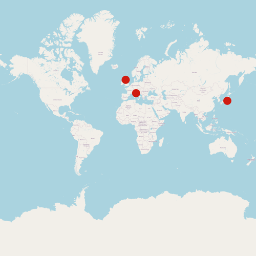
(0.8880574425, 0.39385379958274735)Most users of OpenStreetMap tiles will use these unit positions to select the tiles they need, and then dowload those images – but we can also position these points directly on the global map. I wrote some more Pillow code that converts GPS coordinates to these unit positions, scales those unit positions to the size of the entire map, then draws a coloured circle at each point on the map.
Here’s the code:
from PIL import Image, ImageDraw


gps_coordinates = [
    # Hachiko Memorial Statue in Tokyo
    {"latitude": 35.6590699, "longitude": 139.7006793},
    # Greyfriars Bobby in Edinburgh
    {"latitude": 55.9469224, "longitude": -3.1913043},
    # Fido Statue in Tuscany
    {"latitude": 43.955101, "longitude": 11.388186},
]


im = Image.open("base_map.png")
draw = ImageDraw.Draw(im)

for coord in gps_coordinates:
    x, y = convert_gps_coordinates_to_unit_xy(**coord)

    radius = 32

    draw.ellipse(
        [
            x * im.width - radius,
            y * im.height - radius,
            x * im.width + radius,
            y * im.height + radius,
        ],
        fill="red",
    )

im.save("map_with_dots.png")
and here’s the map it produces:
The nice thing about writing this code in Pillow is that it’s a library I already know how to use, and so I can customise it if I need to. I can change the shape and colour of the points, or crop to specific regions, or add text to the image. I’m sure more sophisticated data visualisation libraries can do all this, and more – but I wouldn’t know how.
The downside is that if I need more advanced features, I’ll have to write them myself. I’m okay with that – trading sophistication for simplicity. I didn’t need to learn a complex visualization library – I was able to write code I can read and understand. In a world full of AI-generated code, writing something I know I understand feels more important than ever.