Cosmetic updates to this site
As well as changing the way I organise my writing, last year I made some cosmetic improvements to this site.
I design everything on this site myself, and I write the CSS by hand – I don’t use any third-party styles or frameworks. I don’t have any design training, and I don’t do design professionally, so I use this site as a place to learn and practice my design skills. It’s a continual work-in-progress, but I’d like to think it’s getting better over time.
I design this site for readers. I write long, text-heavy posts with the occasional illustration or diagram, so I want something that will be comfortable to read and look good on a wide variety of browsers and devices. I get a lot of that “for free” by using semantic HTML and the default styles – most of my CSS is just cosmetic.
Let’s go through some of the changes.
Cleaning up the link styles
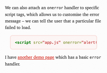
This is what links used to look like:
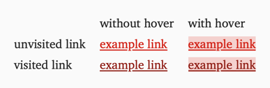
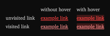
Every page has a tint colour, and then I was deriving different shades to style different links – a darker shade for visited links, a lighter shade for visited links in dark mode, and a background that appears on hover.
I’m generating these new colours programatically, and I was so proud of getting that code working that I didn’t stop to think whether it was a good idea.
In hindsight, I see several issues. The tint colour is meant to give the page a consistent visual appearance, but the different shades diluted that effect. I don’t think their meaning was especially obvious. How many readers ever worked it out? And the hover styles are actively unhelpful – just as you hover over a link you’re interested in, I’m making it harder to read! (At least in light mode – in dark mode, the hover style is barely legible.)
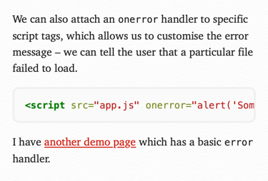
One thing I noticed is that for certain tint colours, the “visited” colour I generated was barely distinguishable from the text colour. So I decided to lean into that in the new link styles: visited links are now the same colour as regular text.
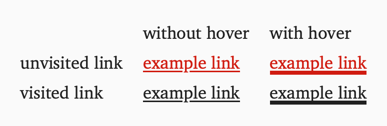
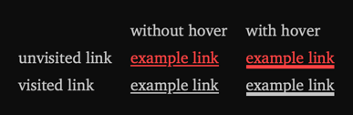
This new set of styles feels more coherent. I’m only using one shade of the tint colour, and I think the meaning is a bit clearer – only new-to-you links will get the pop of colour to stand out from the rest of the text. I’m happy to rely on underlines for the links you’ve already visited. And when you hover, the thick underline means you can see where you are, but the link text remains readable.
Swapping out the font
I swapped out the font, replacing Georgia with Charter. The difference is subtle, so I’d be surprised if anyone noticed:


I’ve always used web safe fonts for this site – the fonts that are built into web browsers, and don’t need to be downloaded first. I’ve played with custom fonts from time to time, but there’s no font I like more enough to justify the hassle of loading a custom font.
I still like Georgia, but I felt it was showing its age – it was designed in 1993 to look good on low-resolution screens, but looks a little chunky on modern displays. I think Charter looks nicer on high-resolution screens, but if you don’t have it installed then I fall back to Georgia.
Making all the roundrects consistent
I use a lot of rounded rectangles for components on this site, including article cards, blockquotes, and code blocks. For a long time they had similar but not identical styles, because I designed them all at different times. There were weird inconsistencies.
For example, why does one roundrect have a 2px border, but another one is 3px? These are small details that nobody will ever notice directly, but undermine the sense of visual together-ness.
I’ve done a complete overhaul of these styles, to make everything look more consistent. I’m leaning heavily on CSS variables, a relatively new CSS feature that I’ve really come to like. Variables make it much easier to use consistent values in different rules.
I also tweaked the appearance:
I’ve removed another two shades of the tint colour. (Yes, those shades were different from the ones used in links.)
Colour draws your attention, so I’m trying to use it more carefully. A link says “click here”. A heading says “start here”. What does a blockquote or code snippet say? It’s just part of the text, so it shouldn’t be grabbing your attention. I think the neutral background also makes the syntax highlighting easier to read, because the tint colour isn’t clashing with the code colours.
I could probably consolidate the shades of grey I’m using, but that’s a task for another day.
I also removed the left indent on blockquotes and code blocks – I think it looks nicer to have a flush left edge for everything, and it means you can read more text on mobile screens. (That’s where I really felt the issues with the old design.)
What’s next?
By tidying up the design and reducing the number of unique elements, I’ve got a bit of room to add something new.
For a while now I’ve wanted a place at the bottom of posts for common actions, or links to related and follow-up posts. As I do more and more long-form, reflective writing, I want to be able to say “if you liked this, you should read this too”.
I want something that catches your eye, but doesn’t distract from the article you’re already reading. Louie Mantia has a version of this that I quite like:

I’ve held off designing this because the existing pages felt too busy, but now I feel like I have space to add this – there aren’t as many clashing colours and components to compete for your attention.
I’m still sketching out designs – my current idea is my rounded rectangle blocks, but with a coloured border instead of a subtle grey, but when I did a prototype, I feel like it’s missing something. I need to try a few more ideas.
Watch this space!