Recreating the bird animation from Swift.org
Last week, the Swift.org website got a redesign. I don’t write much Swift at the moment, but I glanced at the new website to see what’s up and OOH COOL BIRD!
When you load the page, there’s a swooping animation as the bird appears:
I was curious how the animation worked. I thought maybe it was an autoplaying video with no controls, but no, it’s much cooler than that! The animation is implemented entirely in code – there are a few image assets, and then the motion uses JavaScript and the HTML5 canvas element.
I’ve never done anything with animation, so I started reading the code to understand how it works. I’m not going to walk through it in detail, but I do want to show you what I learnt.
All the code from the Swift.org website is open source on GitHub, and the JavaScript file that implements this animation was written by three engineers: Federico Bucchi, Jesse Borden, and Nicholas Krambousanos.
What are the key steps in this animation?
Most of the animation is made up of five “swoop” images, which look like strokes of a paintbrush. These were clearly made by an artist in a design app like Photoshop.


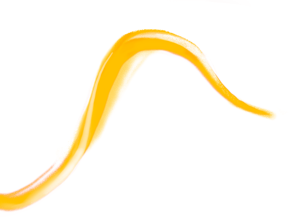
These images are gradually revealed, so it looks like somebody actually painting with a brush. This is more complex than a simple horizontal wipe, the sort of animation you might do in PowerPoint. Notice how, for example, the purple swoop doubles back on itself – if you did a simple left-to-right wipe, it would start as two separate swoops before joining into one. It would look very strange!
Each swoop is animated in the same way, so let’s focus on the purple one, just because it’s the most visually interesting.
The animation is applying a mask to the underlying image, and the mask gradually expands to show more and more of the image. The mask matches the general shape of the brush stroke, so as it expands, it reveals more of the image. I wrote about masking with SVG four years ago, and the principle is similar here – but the Swift.org animation uses HTML5 canvas, not SVG.
The best way to explain this is with a quick demo: as you drag the slider back and forth, you can see the mask get longer and shorter, and that’s reflected in the final image.
original image+mask→final imageanimation progress:
We can break this down into a couple of steps:
- Only draw part of a curved path (drawing the mask)
- Combine the partially-drawn path with the original image (applying the mask)
- Gradually increase the amount of the path that we draw (animating the path)
- Start the animation when the page loads
Let’s go through each of these in turn.
Only draw part of a curved path with a dash pattern
Alongside the graphical image of a brush stroke, the artist supplied an SVG path for the mask:
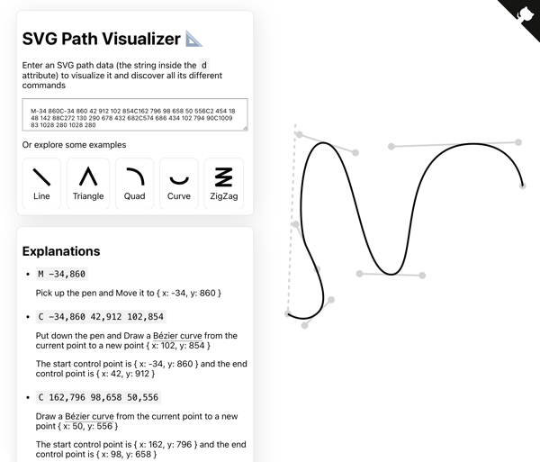
M-34 860C-34 860 42 912 102 854C162 796 98 658 50 556C2 454 18 48 142 88C272 130 290 678 432 682C574 686 434 102 794 90C1009 83 1028 280 1028 280If you’re not familiar with SVG path syntax, I really recommend Mathieu Dutour’s excellent SVG Path Visualizer tool. You give it a path definition, and it gives you a step-by-step explanation of what it’s doing, and you can see where each part of the path appears in the final shape.
We can draw this path on an HTML5 canvas like so:
const canvas = document.querySelector('canvas');

const ctx = canvas.getContext('2d');
ctx.lineWidth = 100;
ctx.lineCap = 'round';
ctx.strokeStyle = 'black';

const path = new Path2D(
  "M-34 860C-34 860 42 912 102 854C162 796 98 658 50 556C2 454 18 48 142 88C272 130 290 678 432 682C574 686 434 102 794 90C1009 83 1028 280 1028 280"
);

ctx.stroke(path);
The way Swift.org draws a partial path is a really neat trick: they’re using a line dash pattern with a variable offset. It took me a moment to figure out what their code was doing, but then it all clicked into place.
First they set a line dash pattern using setLineDash(), which specifies alternating lengths of lines and gaps to draw the line. Here’s a quick demo:
ctx.setLineDash([100])
The path starts in the lower left-hand corner, and notice how it always starts with a complete dash, not a gap. You can change this by setting the lineDashOffset property, which causes the patern to start on a gap, or halfway through a dash. Here’s a demo where you can set both variables at once:
ctx.setLineDash([75])ctx.lineDashOffset = 0;
I find the behaviour of lineDashOffset a bit counter-intuitive: as I increase the offset, it looks like the path is moving backward. I was expecting increasing the offset to increase the start of the first dash, so the line would move in the other direction. I’m sure it makes sense if you have the right mental model, but I’m not sure what it is.
If you play around with these two variables, you might start to see how you can animate the path as if it’s being drawn from the start. Here are the steps:
Set the dash length to the exact length of the path. This means every dash and every gap is the same length as the entire path.
(The length of the purple swoop path is 2776, a number I got from the Swift.org source code. This must have been calculated with an external tool; I can’t find a way to calculate this length in a canvas.)
Set the dash offset to the exact length of the path. This means the entire path is just a gap, which makes it look like there’s nothing there.
Gradually reduce the dash offset to zero. A dash becomes visible at the beginning of the path, and the closer the offset gets to zero, the more of that dash is visible. Eventually it fills the entire path.
Here’s one more demo, where I’ve set up the line dash pattern, and you can adjust the progress. Notice how the line gradually appears:
const progress = 0;const pathLength = 2776 ctx.setLineDash([pathLength]); ctx.lineDashOffset = pathLength * (1 - progress);
Now we have a way to draw part of a path, and as we advance the progress, it looks it’s being drawn with a brush. The real code has a couple of extra styles – in particular, it sets a stroke width and a line cap – but it’s the way the animation uses the dash pattern that really stood out to me.
Once we have our path, how do we use it to mask an image?
Mask an image with a globalCompositeOperation
The masking uses a property of HTML5 canvas called globalCompositeOperation. If you’ve already drawn some shapes on a canvas, you can control how new shapes will appear on top of them – for example, which one appears on top, or whether to clip one to fit inside the other.
I’m familiar with the basic idea – I wrote an article about clips and masks in SVG in 2021 that I still look back on fondly – but I find this feature a bit confusing, especially the terminology. Rather than talking about clips or masks, this property is defined using sources (shapes you’re about to draw on the canvas) and destinations (shapes that are already on the canvas). I’m sure that naming makes sense to somebody, but it’s not immediately obvious to me.
First we need to load the bitmap image which will be our “source”. We can create a new img element with document.createElement("img"), then load the image by setting the src attribute:
const img = document.createElement("img");
img.src = url;
In the Swift.org animation, the value of globalCompositeOperation is source-in – the new shape is only drawn where the new shape and the old shape overlap, and the old shape becomes transparent.
Here’s the code:
// The thick black stroke is the "destination"
ctx.stroke(path)

// The "source-in" mode means only the part of the source that is
// inside the destination will be shown, and the destination will
// be transparent.
ctx.globalCompositeOperation = 'source-in'

// The bitmap image is the "source"
ctx.drawImage(img, 0, 0)
and here’s what the result looks like, when the animation is halfway complete:
destination+source→final image
There are many different composite operations, including ones that combine colours or blend pixels from both shapes. If you’re interested, you can read the docs on MDN, which includes a demo of all the different blending modes.
This is a bit of code where I can definitely understand what it does when I read it, but I wouldn’t feel confident writing something like this myself. It’s too complex a feature to wrap my head around with a single example, and the other examples I found are too simple and unmotivating. (Many sites use the example of a solid red circle and a solid blue rectangle, which I find completely unhelpful because I can produce the final result in a dozen other ways. What’s the real use case for this property? What can I only do if I use globalCompositeOperation?)
Then again, perhaps I’m not the target audience for this feature. I mostly do simple illustrations, and this is a more powerful graphics operation. I’m glad to know it’s there, even if I’m not sure when I’ll use it.
Now we can draw a partial stroke and use it as a mask, how do we animate it?
Animate the brush stroke with Anime.js
Before I started reading the code in detail, I tried to work out how I might create an animation like this myself.
I haven’t done much animation, so the only thing I could think of was JavaScript’s setTimeout() and setInterval() functions. Using those repeatedly to update a progress value would gradually draw the stroke. I tried it, and that does work! But I can think of some good reasons why it’s not what’s used for the animation on Swift.org.
The timing of setTimeout() and setInterval() isn’t guaranteed – the browser may delay longer than expected if the system is under load or you’re updating too often. That could make the animation jerky or stuttery. Even if the delays fire correctly, it could still look a bit janky – you’re stepping between a series of discrete frames, rather than smoothly animating a shape. If there’s too much of a change between each frame, it would ruin the illusion.
Swift.org is using Julian Garnier’s Anime.js animation library. Under the hood, this library uses web technologies like requestAnimationFrame() and hardware acceleration – stuff I’ve heard of, but never used. I assume these browser features are optimised for doing smooth and efficient animations – for example, they must sync to the screen refresh rate, only drawing frames as necessary, whereas using setInterval() might draw lots of unused frames and waste CPU.
Anime.js has a lot of different options, but the way Swift.org uses it is fairly straightforward.
First it creates an object to track the state of the animation:
const state = { progress: 0 };Then there’s a function that redraws the swoop based on the current progress. It clears the canvas, then redraws the partial path and the mask:
function updateSwoop() {
  // Clear canvas before next draw
  ctx.clearRect(0, 0, canvas.width, canvas.height);

  // Draw the part of the stroke that we want to display
  // at this point in the animation
  ctx.lineDashOffset = swoop.pathLength * (1 - state.progress);
  ctx.stroke(new Path2D(swoop.path));

  // Draw the image, using "source-in" to apply a mask
  ctx.globalCompositeOperation = 'source-in'
  ctx.drawImage(img, 0, 0);

  // Reset to default for our next stroke paint
  ctx.globalCompositeOperation = 'source-out';
}
Finally, it creates a timeline, and adds an animation for each swoop.
When it adds the animation, it passes five things:
- the
stateobject - the desired end state (
progress: 1) - the duration of the animation (1000ms = 1s)
- an easing function; in this case
in(1.8)means the animation will start slowly and gradually speed up - the
updateSwoopfunction as a callback for every time the animation updates
const tl = anime.createTimeline()

tl.add(
  state,
  { progress: 1, duration: 1000, ease: 'in(1.8)', onUpdate: updateSwoop }
);
You may have wondered why the state is an object, and not a single value like const progress = 0. If we passed a numeric value to tl.add(), JavaScript would pass it by value, and any changes wouldn’t be visible to the updateSwoop() function. By wrapping the progress value in an object, JavaScript will pass by reference instead, so changes made inside tl.add() will be visible when updateSwoop() is called.
Now we can animate our swoop, as if it was a brush stroke. There’s one final piece: how do we start the animation?
Start the animation with a MutationObserver
If I want to do something when a page loads, I normally watch for the DOMContentLoaded event, for example:
window.addEventListener("DOMContentLoaded", () => {
  runAnimation();
});
But the Swift.org animation has one more thing to teach me, because it does something different.
In the HTML, it has a <div> that wraps the canvas elements where it draws all the animations:
<div class="animation-container">
    <canvas id="purple-swoop" width="1248" height="1116"></canvas>
    <canvas id="white-swoop-1" width="1248" height="1116"></canvas>
    <canvas id="orange-swoop-top" width="1248" height="1116"></canvas>
    <canvas id="orange-swoop-bottom" width="1248" height="1116"></canvas>
    <canvas id="white-swoop-2" width="1248" height="1116"></canvas>
    <canvas id="bird" width="1248" height="1116"></canvas>
</div>
Then it uses a MutationObserver to watch the entire page for changes, and start the animation once it finds this wrapper <div>:
// Start animation when container is mounted
const observer = new MutationObserver(() => {
  const animContainer = document.querySelector('.animation-container')
  if (animContainer) {
    observer.disconnect()
    heroAnimation(animContainer)
  }
})

observer.observe(document.documentElement, {
  childList: true,
  subtree:   true,
})
It achieves the same effect as watching for DOMContentLoaded, but in a different way.
I don’t think there’s much difference between DOMContentLoaded and MutationObserver in this particular case, but I can see that MutationObserver is more flexible for the general case. You can target a more precise element than “the entire document”, and you can look for changes beyond just the initial load.
I suspect the MutationObserver approach may also be slightly faster – I added a bit of console logging, and if you don’t disconnect the observer, it gets called three times when loading the Swift.org homepage. If the animation container exists on the first call, you can start the animation immediately, rather than waiting for the rest of the DOM to load. I’m not sure if that’s a perceptible difference though, except for very large and complex web pages.
This step completes the animation. When the page loads, we can start an animation that draws the brush stroke as a path. As the animation continues, we draw more and more of that path, and the path is used as a mask for a bitmap image, gradually unveiling the purple swoop.
Skip the animation if you have (prefers-reduced-motion: reduce)
There’s one other aspect of the animation on Swift.org that I want to highlight. At the beginning of the animation sequence, it checks to see if you have the “prefers reduced motion” preference. This is an accessibility setting that allows somebody to minimise non-essential animations.
const isReduceMotionEnabled = window.matchMedia(
  '(prefers-reduced-motion: reduce)',
).matches
Further down, the code checks for this preference, and if it’s set, it skips the animation and just renders the final image.
I’m already familiar with this preference and I use it on a number of websites. sites, but it’s still cool to see.
Closing thoughts
Thanks again to the three people who wrote this animation code: Federico Bucchi, Jesse Borden, and Nicholas Krambousanos. They wrote some very readable JavaScript, so I could understand how it worked. The ability to “view source” and see how a page works is an amazing feature of the web, and finding the commit history as open source is the cherry on the cake.
I really enjoyed writing this post, and getting to understand how this animation works. I don’t know that I could create something similar – in particular, I don’t have the graphics skills to create the bitmap images of brush strokes – but I’d feel a lot more confident trying than I would before. I’ve learned a lot from reading this code, and I hope you’ve learned something as well.