Doing my own syntax highlighting (finally)
I had syntax highlighting in the very first version of this blog, and I never really thought about that decision. I was writing a programming blog, and I was including snippets of code, so obviously I should have syntax highlighting.
Over the next thirteen years, I tweaked and refined the rest of the design, but I never touched the syntax highlighting. I’ve been applying a rainbow wash of colours that somebody else chose, because I didn’t have any better ideas.
This week I read Nikita Prokopov’s article Everyone is getting syntax highlighting wrong, which advocates for a more restrained approach. Rather than giving everything a colour, he suggests colouring just a few key elements, like strings, comments, and variable definitions. I don’t know if that would work for everybody, but I like the idea, and it gave me the push to try something new.
It’s time to give code snippets the same care I’ve given the rest of this site.
What have I changed?
I’ve stripped back the syntax highlighting to a few key rules:
- Comments in red
- Strings in green
- Numbers, booleans, and other constants in magenta
- Variable definitions in blue
- Punctuation in grey
Everything else is the default black/white.
This is similar to Nikita’s colour scheme “Alabaster”, but I chose my own colours to match my site palette. I’m also making my own choices about how to interpret these rules, because real code doesn’t always fall into neat buckets.
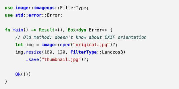
Here’s a snippet of Rust code with the old syntax highlighting:
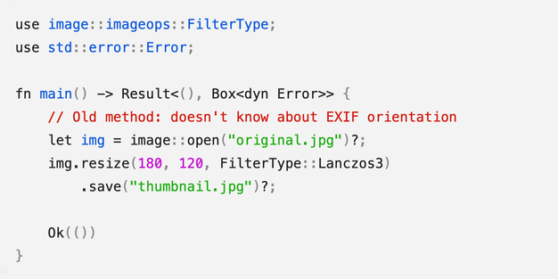
Here’s the same code in my new design:
Naturally, these code blocks work in both light and dark mode.
The new design is cleaner, it fits in better with the rest of the site, and I really like it. Some of that will be novelty and the IKEA effect, but I see other benefits to this simplified palette.
How does it work?
Converting code to HTML
I use Rouge as my syntax highlighter. I give it a chunk of code and specify the language, and it parses the code into a sequence of tokens – like operators, variables, or constants. Rouge returns a blob of HTML, with each token wrapped in a <span> that describes the token type.
For example, if I ask Rouge to highlight the Python snippet:
print("hello world")it produces this HTML:
<span class="nf">print</span><span class="p">(</span><span class="sh">"</span><span class="s">hello world</span><span class="sh">"</span><span class="p">)</span>The first token is print, which is a function name (Name.Function, or class="nf"). The ( and ) are punctuation ("p") and the string is split into quotation marks (sh for String.Heredoc) and the text (s for String). You can see all the tokens in this short example, and all the possible token types are listed in the Pygments docs. (Pygments is another syntax highlighting library, but Rouge uses the same classification system.)
Each token has a different class in the HTML, so I can style tokens with CSS. For example, if I want all function names to be blue, I can target the "nf" class:
.nf { color: blue; }I wrap the entire block in a <pre> tag with a language class, like <pre class="language-go">, so I can also apply per-language styles if I want.
Separating variable/function definitions and usage
I want to highlight variables when they’re defined, not every time they’re used. This gives you an overview of the structure, without drowning the code in blue.
This is tricky with Rouge, because it has no semantic understanding of the code – it only knows what each token is, not how it’s being used. In the example above, it knows that print is the name of a function, but it doesn’t know if the function is being called or being defined.
I could use something smarter, like the language servers used by modern IDEs, but that’s a lot of extra complexity. It might not even work – many of my code snippets are fragments, not complete programs, and wouldn’t parse cleanly.
Instead, I’m manually annotating my code snippets to mark definitions. I wrote a Jekyll plugin that reads those annotations, and modifies the HTML from Rouge to add the necessary highlights. It’s extra work, but I already spend a lot of time trying to pick the right snippet of code to make my point. These annotations are quick and easy, and it’s worth it for a clearer result.
Older posts don’t have these annotations, so they won’t get the full benefit of the new colour scheme, but I’m gradually updating them.
What do I like about this new design?
It’s pushed me to think more about syntax highlighting
Now that I’m not using somebody else’s rules, I’m paying more attention to how my code looks. I’m thinking more carefully about how my rules should apply. I’m noticing when colours feel confusing or unclear, and finding small ways to tweak them to improve clarity.
For example, “variable definitions in blue” sounds pretty clear cut, but does that include imports? Function parameters? What about HTML or CSS, where variables aren’t really a thing? What parts of the code do I think are important and worth highlighting?
I could have asked these questions at any time, but changing my syntax highlighting gave me the push to actually do it.
It makes comments more prominent
In my first programming job, I worked in a codebase with extensive comemnts. They were a good starting point in unfamiliar code, with lots of context, explanation, and narrative. The company’s default IDE showed comments in bright blue, and looking back, I’m sure that colour choice encouraged the culture of detailed documentation.
I realise now how unusual that was, but at the time it was my only experience of professional software development. I carried that habit of writing coomments into subsequent jobs, but I’d forgotten the colour scheme. Now, I’m finally reviving that good idea.
Comments are bright red in my new theme – not the subdued grey used by so many other themes. The pop of colour makes comments easier to spot and more inviting to read. I’ve also ported this style to my IDE, and now when I write comments, I don’t feel like my words are disappearing.
It might be easier to read
I was inspired to make this change by reading Nikita Prokopov’s article, which argues for a minimal colour scheme – but not everyone agrees.
Syntax highlighting is mostly a matter of taste. Some programmers like a clean, light theme, others prefer high-contrast dark themes with bold colours. There’s lots of research into how we read code, but as far as I know, there’s no strong evidence or consensus in favour of any particular approach.
Whatever your taste, I think code is easier to read in a colour scheme you’re already familiar with. You know what the colours mean, so your brain doesn’t have to learn anything. A new scheme might grow on you over time, but at first, it’s more likely to be distracting than helpful.
That’s a problem for a blog like this. Most readers find a single post through search, read something useful, and never return. They’re not reading enough code here to learn my colour scheme, and unfamiliar colours are just noise.
With that in mind, I think a minimal palette works better. My posts only contain short snippets of code – enough to make a point, but not full files or complex programs. When you’re only reading a small amount of code, it’s more useful to highlight key elements than wash everything in colour.
Better late than never
I’ve wanted to improve my code snippets for a long time, but it always felt overwhelming. I’m used to colour themes which use a large palette, and I don’t have the design skills to choose that many colours. It wasn’t until I thought about using a smaller palette that this felt doable
I picked my new colours just a few days ago, and already the old design feels stale and tired. I’d planned to spend more time tinkering before I make it live, but it’s such an improvement I want to use it immediately.
I love having a little corner of the web which is my own personal sandbox. Thirteen years in, and I’m still finding new ways to make myself smile.