Rendering a chat thread in CSS and JavaScript
The first iteration of my scrapbook of social media only had posts from public or semi-public social media sites – Twitter, Instagram, Tumblr, and so on. Every post is saved as JSON metadata, and rendered as HTML in my web browser.
For a while now, I’ve wanted to add support for text conversations. I don’t care about saving my texts en masse, but there are moments which stand out and which I’d like to save. I thought this would be quite straightforward, but I ran into trouble rendering chat bubbles in CSS. I got it working once I walked through it carefully, and I wanted to explain how it works – so I understand it now, and so I remember it later.
Let’s start with some semantic HTML which represents a group chat with three participants, based on characters from Terry Pratchett’s Monstrous Regiment:
<div class="conversation">
  <div class="message-group" data-sender="Wazzer">
    <blockquote>The Duchess says your path takes you further</blockquote>
    <cite>Wazzer</cite>
  </div>
  <div class="message-group" data-sender="Jackrum">
    <blockquote>Oh yeah? And where’s that, then? Somewhere with a good pub, I hope!</blockquote>
    <cite>Jackrum</cite>
  </div>
  <div class="message-group" data-sender="Wazzer">
    <blockquote>The Duchess says</blockquote>
    <blockquote>um</blockquote>
    <blockquote>it should lead to the town of Scritz</blockquote>
    <cite>Wazzer</cite>
  </div>
  <div class="message-group" data-sender="Jackrum">
    <blockquote>Scritz? Nothing there</blockquote>
    <blockquote>Dull town</blockquote>
    <cite>Jackrum</cite>
  </div>
  <div class="message-group" data-sender="Polly">
    <blockquote>…</blockquote>
    <cite>Polly</cite>
  </div>
</div>
I’m using a <div class="conversation"> for the conversation as a whole, then a <div class="message-group"> to group consecutive messages from each sender. Each message is a <blockquote>, and the sender is shown in a <cite> element. The sender is also in a data-sender attribute on each message group – this will allow us to apply different styles based on the sender.
When rendered with the browser’s default stylesheet, this doesn’t look anything like a text message conversation, but it’s also not unreadable:
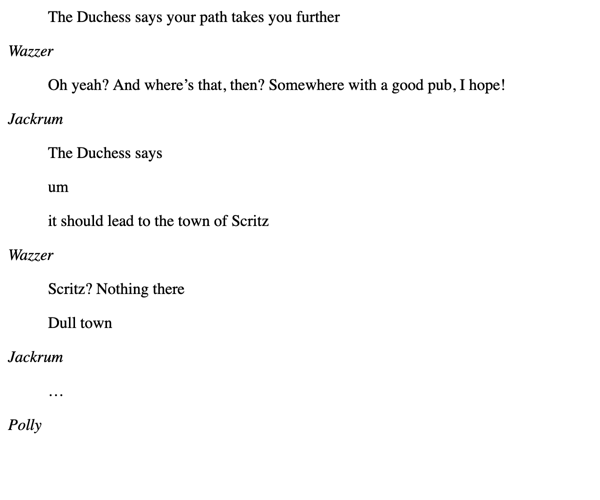
I always try to use semantic HTML when I can, and lean on the browser’s default styles – they’re a solid baseline and give me a bare minimum even if my CSS breaks. I dislike the approach of many CSS frameworks to reset the browser styles and rebuild them from scratch.
Let’s start by adding some CSS that makes the messages look more like chat bubbles, tweak the spacing so it’s clearer who sent which message, and clamp the width. Let’s suppose this conversation is told from Sergeant Jackrum’s perspective, so we’ll colour his messages differently:
.conversation {
  width: 450px;
  padding: 1em;

  .message-group {
    &:not(:last-child) {
      margin-bottom: 1.5em;
    }

    blockquote {
      border: 2px solid green;
      background: palegreen;
      margin: 0;
      border-radius: 15px;
      margin-bottom:  4px;
      padding:        7px;
    }

    &[data-sender="Jackrum"] blockquote {
      border: 2px solid grey;
      background: lightgrey;
    }
  }
}
There are a couple of neat tricks in here: I’m using CSS nesting to keep the CSS tidy, along with the & nesting selector. These are two features that were previously only available in preprocessors like Sass, but are now widely supported by vanilla CSS. Then I’m using an attribute selector with the data-sender attribute to apply styles to messages sent by Jackrum.
Here’s what it looks like:
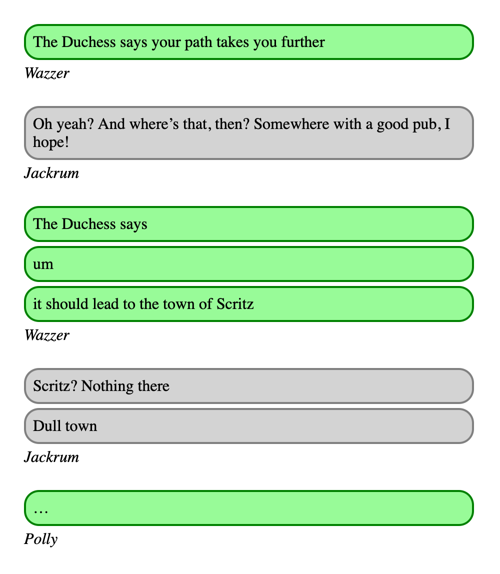
This already looks a bit like a messaging app! So far, so easy – these are all CSS properties I’m comfortable with. The colours and spacing are all arbitrary; I just wanted enough to prove the basic idea before moving on to the tricky part – right-sizing and right-aligning the bubbles. In the real scrapbook, I match the colours to the messaging app where the conversation took place – light blue for iMessage, dark blue for Signal, green for SMS, and so on.
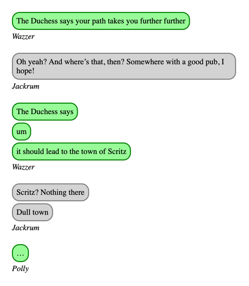
Messaging apps usually resize their text bubbles so they’re only as large as the text, rather than filling the width of the screen. We can do a first pass at this with three rules:
blockquote {
  width: max-content;
  max-width: 100%;
  box-sizing: border-box;
}
The max-content keyword is a new one for me – it expands the element to the maximum size required to show its contents, without any soft wrapping.
For short messages, this shrinks the bubble so it’s only as wide as needed for the text.
For long messages, I need the max-width property to avoid the bubble expanding beyond the width of the conversation, and box-sizing: border-box ensures that width applies to the entire element (padding and borders included), not just the text inside. Without them, the bubbles would expand beyond the right edge of the conversation.
Here’s what it looks like now:
The next change is to make Jackrum’s messages appear on the right-hand side of the screen.
Initially I tried adding margin-left: auto to the message group, but the message bubbles didn’t budge – the message group still takes up the full width of the screen, even if the individual messages don’t. Then I tried playing with flexbox layouts, which I’m less familiar with but I did get working. These flex properties achieve the desired effect:
.message-group {
  display: flex;
  flex-direction: column;
  align-items: flex-start;

  &[data-sender="Jackrum"] {
    align-items: flex-end;
  }
}
But flexbox is an area of CSS I don’t know that well, and while I can understand it, I need to refer to the documentation every time.
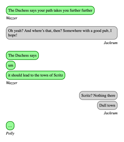
After thinking some more, I realised that I could apply margin-left: auto to the blockquote elements rather than the message group. This has a similar effect, but now it’s using CSS properties I understand:
.message-group[data-sender="Jackrum"] {
  blockquote {
    margin-left: auto;
  }

  cite {
    display: block;
    text-align: right;
  }
}
I’m going to use the margin approach because I understand it better and this is only a personal project, but I can see reasons for preferring flex. For example, if some of the messages are written right-to-left and you want to flip the order of the bubbles, the flexbox approach will automatically do the right thing if you set dir="rtl" – whereas the margins need to be manually specified.
This looks pretty close to what I want:
Next, let’s square off the corner of the last message in each group, and limit the width of the message bubbles so they don’t fill the entire width of the screen. Here are the CSS rules:
blockquote {
  max-width: 60%;
}

.message-group:not([data-sender="Jackrum"]) {
  blockquote:has(+ cite) {
    border-bottom-left-radius: 0;
  }
}

.message-group[data-sender="Jackrum"] {
  blockquote:has(+ cite) {
    border-bottom-right-radius: 0;
  }
}
The choice of max-width: 60% is arbitrary; I just want the bubbles to avoid filling the whole conversation.
To round off the corner of the last message bubble in each conversation, I’m targeting the final message by using the :has() pseudo-class to find a blockquote which is immediately followed by a cite element. Then I set a custom border radius, depending on whether the message is on the left/right of the screen.
Here’s what the conversation looks like now:
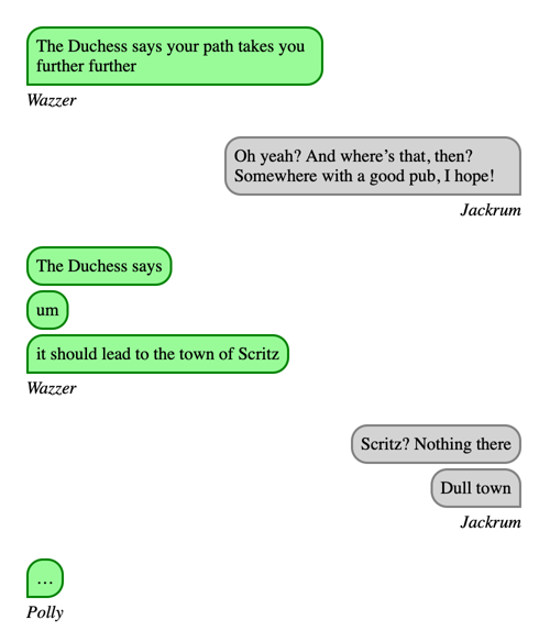
The last issue is that sometimes the message bubbles have extra whitespace – notice how Jackrum’s first message has unnecessary padding on the right-hand side. The bubble could shrink slightly without affecting the text, and it would look better.
I don’t think you can do a “shrink-wrap” layout in pure CSS, but we can do it with a bit of JavaScript. In particular, we can use a Range object to get all the text and nodes in each blockquote, use the getBoundingClientRect() method to work out how much space that takes up on the page, then resize the blockquote to fit:
function shrinkWrap(elem) {
  const range = document.createRange();
  range.selectNodeContents(elem);

  const bbox = range.getBoundingClientRect();
  elem.style.width = `${bbox.width}px`;
  elem.style.boxSizing = "content-box";
}

window.addEventListener("load", () =>
  document
    .querySelectorAll(".message-group blockquote")
    .forEach(shrinkWrap)
);
We set the width to an exact pixel count, and reset box-sizing to the default content-box – this means the width is applied to the text in the bubble, and then the padding and borders are added after. If we stuck to box-sizing: border-box, the content would be narrower than the width and be wrapped incorrectly.
This only runs on page load – after the blockquote elements have been drawn for the first time. You could also run it when the window is resized to make the bubbles reflow when the screen width changes, but I haven’t missed that in my scrapbook.
We can complement this with text-wrap: balance on the blockquote elements, which balances the number of characters on each line. This gives a tighter fit within the bubble, because each line is about the same length.
Here’s the final result:
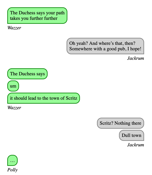
Notice that Wazzer’s first message now fills the bubble better, and there’s no extra space on the right-hand side of Jackrum’s first message.
I’m happy with this as a visual representation of a text conversation.
The other thing I considered is some sort of visual flourish on the corner above the sender’s name. The simple right angle is fine, but the new CSS corner-shape and border-shape properties look like they might allow more interesting shapes here. Perhaps at some point I could add a nice-looking tail to the message bubbles? It’s only experimental so I haven’t tried it yet, but I’ve got an eye on it for the future.
Putting it all together, here’s my final CSS:
.conversation {
  width: 450px;
  padding: 1em;

  .message-group {
    &:not(:last-child) {
      margin-bottom: 1.5em;
    }

    blockquote {
      border: 2px solid green;
      background: palegreen;

      margin: 0;
      border-radius: 15px;
      margin-bottom:  4px;
      padding:        7px;

      width: max-content;
      max-width: 60%;
      box-sizing: border-box;

      text-wrap: balance;
    }

    &:not([data-sender="Jackrum"]) {
      blockquote:has(+ cite) {
        border-bottom-left-radius: 0;
      }
    }

    &[data-sender="Jackrum"] {
      blockquote {
        border: 2px solid grey;
        background: lightgrey;

        margin-left: auto;
      }

      blockquote:has(+ cite) {
        border-bottom-right-radius: 0;
      }

      cite {
        display: block;
        text-align: right;
      }
    }
  }
}
I’m really pleased with the final effect, and it’s a great addition to my scrapbook.
My mistake, as always, was trying to build this by editing the CSS for the existing project – rather than developing it as a standalone component first. CSS is tricky and difficult to reason about, and trying to rush a fix is never the optimal outcome.
This may not be a perfect chat UI, but it’s pretty close, and I understand exactly how it works. I’m happy with that.