The Good, the Bad, and the Gutters
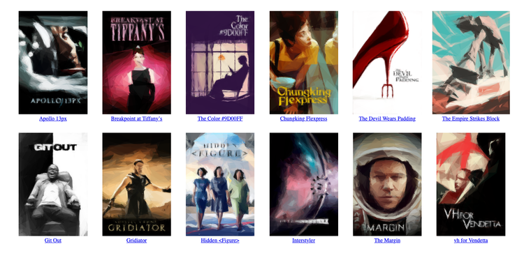
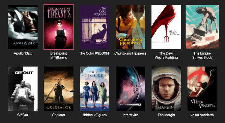
I’ve been organising my local movie collection recently, and converting it into a static site. I want the homepage to be a scrolling grid of movie posters, where I can click on any poster and start watching the movie. Here’s a screenshot of the design:
This scrolling grid of posters is something I’d like to reuse for other media collections – books, comics, and TV shows.
I wrote an initial implementation with CSS grid layout, but over time I found rough edges and bugs. I kept adding rules and properties to “fix” the layout, but these piecemeal changes introduced new bugs and conflicts, and eventually I no longer understood the page as a whole. This gradual degradation often happens when I write CSS, and when I no longer understand how the page works, it’s time to reset and start again.
To help me understand how this layout works, I’m going to step through it and explain how I built the new version of the page.
Step 1: Write the unstyled HTML
This is a list of movies, so I use an unordered list <ul>. Each list item is pretty basic, with just an image and a title. I wrap them both in a <figure> element – I don’t think that’s strictly necessary, but it feels semantically correct to group the image and title together.
<ul id="movies">
  <li>
    <a href="#">
      <figure>
        <img src="apollo-13px.png">
        <figcaption>Apollo 13px</figcaption>
      </figure>
    </a>
  </li>
  <li>
    <a href="#">
      <figure>
        <img src="breakpoint-at-tiffanys.png">
        <figcaption>Breakpoint at Tiffany’s</figcaption>
      </figure>
    </a>
  </li>
  ...
</ul>
I did wonder if this should be an ordered list, because the list is ordered alphabetically, but I decided against it because the numbering isn’t important.
Having a particular item be #1 is meaningful in a ranked list (the 100 best movies) or a sequence of steps (a cooking recipe), but there’s less significance to #1 in an alphabetical list. If I get a new movie that goes at the top of the list, it doesn’t matter that the previous #1 has moved to #2.
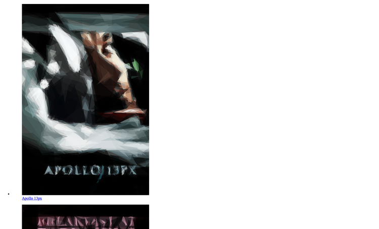
This is an unstyled HTML page, so it looks pretty rough:
Step 2: Add a CSS grid layout
Next, let’s get the items arranged in a grid. This is a textbook use case for CSS grid layout.
I start by resetting some default styles: removing the bullet point and whitespace from the list, and the whitespace around the figure.
#movies {
  list-style-type: "";
  padding: 0;
  margin:  0;

  figure {
    margin: 0;
  }
}Then I create a grid that creates columns which are 200px wide, as many columns as will fit on the screen. The column width was an arbitrary choice and caused some layout issues – I’ll explain how to choose this properly in the next step.
#movies {
  display: grid;
  grid-template-columns: repeat(auto-fill, 200px);
  column-gap: 1em;
  row-gap:    2em;
}
By default, browsers show images at their original size, which means they overlap each other. For now, clamp the width of the images to the columns, so they don’t overlap:
#movies {
  img {
    width: 100%;
  }
}
With these styles, the grid fills up from the left and stops as soon as it runs out of room for a full 200px column. It looks a bit like an unfinished game of Tetris – there’s an awkward gap on the right-hand side of the window that makes the page feel off-balance.
We can space the columns more evenly by adding a justify-content property which tells the browser to create equal spacing between each of them, including on the left and right-hand side:
#movies {
  justify-content: space-evenly;
}
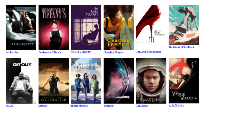
With just ten CSS properties, the page looks a lot closer to the desired result:
After this step, what stands out here is the inconsistent heights, especially the text beneath the posters. The mismatched height of The Empire Strikes Block is obvious, but the posters for The Devil Wears Padding and vh for Vendetta are also slightly shorter than their neighbours. Let’s fix that next.
Step 3: Choosing the correct column size
Although movie posters are always portrait orientation, the aspect ratio can vary. Because my first grid fixes the width, some posters will be a different height to others.
I prefer to have the posters be fixed height and allow varied widths, so all the text is on the same level. Let’s replace the width rule on images:
#movies {
  img {
    height: 300px;
  }
}
This causes an issue with my columns, because now some of the posters are wider than 200px, and overflow into their neighbour. I need to pick a column size which is wide enough to allow all of my posters at this fixed height. I can calculate the displayed width of a single poster:
Then I pick the largest display width in my collection, so even the widest poster has enough room to breathe without overlapping its neighbour.
In my case, the largest poster is 225px wide when it’s shown at 300px tall, so I change my column rule to match:
#movies {
  grid-template-columns: repeat(auto-fill, 225px);
}
If I ever change the height of the posters or get a wider poster, I’ll need to adjust this widths. If I was adding movies too fast for that to be sustainable, I’d look at using something like object-fit: cover to clip anything that was extra wide. I’ve skipped that here because I don’t need it, and I like seeing the whole poster.
If you have big columns or small devices, you need some extra CSS to make columns and images shrink when they’re wider than the device, but I can ignore that here. A 225px column is narrower than my iPhone, which is the smallest device I’ll use this for. (I did try writing that CSS, and I quickly got stuck. I’ll come back to it if it’s ever an issue, but I don’t need it today.)
Now the posters which are narrower than the column are flush left with the edge of the column, whereas I’d really like them to be centred inside the column. I cam fix this with one more rule:
#movies {
  li {
    text-align: center;
  }
}
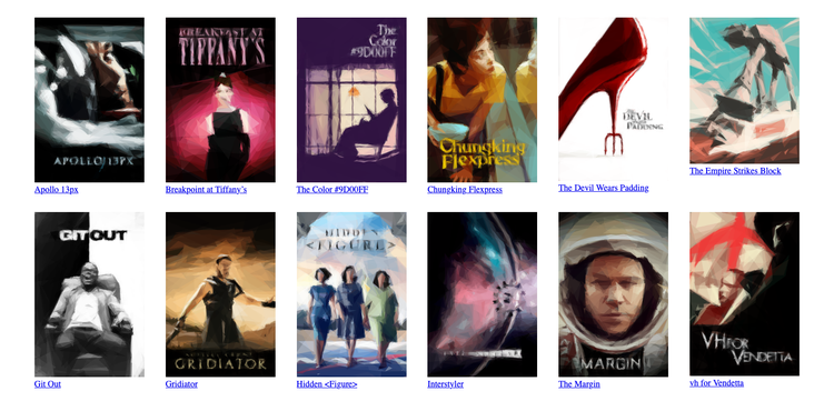
This is a more subtle transformation from the previous step – nothing’s radically different, but all the posters line up neatly in a way they didn’t before.
Swapping fixed width for fixed height means there’s now an inconsistent amount of horizontal space between posters – but I find that less noticeable. You can’t get a fixed space in both directions unless all your posters have the same aspect ratio, which would mean clipping or stretching. I’d rather have the slightly inconsistent gaps.
The white background and blue underlined text are still giving “unstyled HTML page” vibes, so let’s tidy up the colours.
Step 4: Invert the colours with a dark background
The next set of rules change the page to white text on a dark background. I use a dark grey, so I can distinguish the posters which often use black:
body {
  background: #222;
  font-family: -apple-system, sans-serif;
}

#movies {
  a {
    color: white;
    text-decoration: none;
  }
}
Let’s also make the text bigger, and add a bit of spacing between it and the image. And when the title and image are more spaced apart, let’s increase the row spacing even more, so it’s always clear which title goes with which poster:
#movies {
  grid-row-gap: 3em;

  figcaption {
    font-size:  1.5em;
    margin-top: 0.4em;
  }
}
The movie title is a good opportunity to use text-wrap: balance. This tells the browser to balance the length of each line, which can make the text look a bit nicer. You’ll get several lines of roughly the same length, rather than one or more long lines and a short line. For example, it changes “The Empire Strikes // Block” to the more balanced “The Empire // Strikes Block”.
#movies {
  figcaption {
    text-wrap: balance;
  }
}
Here’s what the page looks like now, which is pretty close to the final result:
What’s left is a couple of dynamic elements – hover states for individual posters, and placeholders while images are loading.
Step 5: Add a border/underline on hover
As I’m mousing around the grid, I like to add a hover style that shows me which movie is currently selected – a coloured border around the poster, and a text underline on the title.
First, I use my dominant_colours tool to get a suitable tint colour for use with this background:
$ dominant_colours gridiator.png --best-against-bg '#222'
▇ #ecd3ab
Then I add this to my markup as a CSS variable:
<ul id="movies">
  ...
  <li style="--tint-colour: #ecd3ab">
    <a href="#">
      <figure>
        <img src="gridiator.png">
        <figcaption>Gridiator</figcaption>
      </figure>
    </a>
  </li>
  ...
</ul>
Finally, I can add some hover styles that use this new variable:
#movies {
  a:hover {
    figcaption {
      text-decoration-line: underline;
      text-decoration-thickness: 3px;
    }

    img {
      outline: 3px solid var(--tint-colour);
    }
  }
}
I’ve added the text-decoration styles directly on the figcaption rather than the a, because browsers are inconsistent about whether those properties are inherited from parent elements.
I used outline instead of border so the 3px width doesn’t move the image when the style is applied.
Here’s what the page looks like when I hover over Breakpoint at Tiffany’s:
We’re almost there!
Step 6: Add placeholder colours
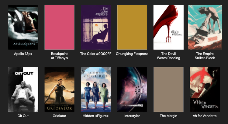
As my movie collection grows, I want to lazy load my images so I don’t try to load them all immediately, especially posters that aren’t scrolled into view. But then if I scroll and I’m on a slow connection, it can take a few seconds for the image to load, and until then the page has a hole. I like having solid colour placeholders which get replaced by the image when it loads.
First I have to insert a wrapper <div> which I’m going to colour, and a CSS variable with the aspect ratio of the poster so I can size it correctly:
<ul id="movies">
  ...
  <li style="--tint-colour: #ecd3ab; --aspect-ratio: 510 / 768">
    <a href="#">
      <figure>
        <div class="wrapper">
          <img src="gridiator.png" loading="lazy">
        </div>
        <figcaption>Gridiator</figcaption>
      </figure>
    </a>
  </li>
  ...
</ul>
We can add a coloured background to this wrapper and make it the right size:
#movies {
  img, .wrapper {
    height: 300px;
    aspect-ratio: var(--aspect-ratio);
  }

  .wrapper {
    background: var(--tint-colour);
  }
}
But a <div> is a block element by default, so it isn’t centred properly – it sticks to the left-hand side of the column, and doesn’t line up with the text. We could add margin: 0 auto; to move it to the middle, but that duplicates the text-align: center; property we wrote earlier. Instead, I prefer to make the wrapper an inline-block, so it follows the existing text alignment rule:
#movies {
  .wrapper {
    display: inline-block;
  }
}
Here’s what the page looks like when some of the images have yet to load:
And we’re done!
The final page
There’s a demo page where you can try this design and see how it works in practice.
Here’s what the HTML markup looks like:
<ul id="movies">
  <li style="--tint-colour: #dbdfde; --aspect-ratio: 510 / 768">
    <a href="#">
      <figure>
        <div class="wrapper">
          <img src="apollo-13px.png" loading="lazy">
        </div>
        <figcaption>Apollo 13px</figcaption>
      </figure>
    </a>
  </li>
  ...
</ul>
and here’s the complete CSS:
body {
  background: #222;
  font-family: -apple-system, sans-serif;
}

#movies {
  list-style-type: "";
  padding: 0;
  margin:  0;

  display: grid;
  grid-template-columns: repeat(auto-fill, 225px);
  column-gap: 1em;
  row-gap:    3em;

  justify-content: space-evenly;

  figure {
    margin: 0;
  }

  li {
    text-align: center;
  }

  a {
    color: white;
    text-decoration: none;
  }

  figcaption {
    font-size:  1.5em;
    margin-top: 0.4em;
    text-wrap: balance;
  }

  a:hover, a#tiffanys {
    figcaption {
      text-decoration-line: underline;
      text-decoration-thickness: 3px;
    }

    img {
      outline: 3px solid var(--tint-colour);
    }
  }

  img, .wrapper {
    height: 300px;
    aspect-ratio: var(--aspect-ratio);
  }

  .wrapper {
    background: var(--tint-colour);
    display: inline-block;
  }
}
I’m really happy with the result – not just the final page, but how well I understand it. CSS can be tricky to reason about, and writing this step-by-step guide has solidified my mental model.
I learnt a few new details while checking references, like the outline property for hover states, the way text-decoration isn’t meant to inherit, and the fact that column-gap and row-gap have replaced the older grid- prefixed versions.
This layout is working well enough for now, but more importantly, I’m confident I could tweak it if I want to make changes later.

