Parody posters for made-up movies
In my previous post, I needed a collection of movies to show off my CSS grid layout. The easy thing to do would be to use real movie posters, but I decided to have some fun and get a custom collection. I went to Blockbuster, HBO Max-Width, and Netflex, and this is what I got:

In this post, I’ll explain how I created this collection, and why I spent so much time on it.
Glossary of the Galaxy: what do the titles mean?
Each title is a reference to a concept in CSS or web development:
- Apollo 13px
- Pixels (
px) are a unit of length in CSS. They’re a common way to define fixed sizes for text, borders, and spacing.- Breakpoint at Tiffany’s
- A breakpoint is the screen width at which a website’s layout changes – for example, when it switches from a single column on a phone to a multi-column grid on a desktop.
- The Color #9D00FF
- This is a hexadecimal colour code for a shade of purple. Hex codes are a common way to define colours in CSS.
- Chungking Flexpress
- Flexbox is a layout model that allows elements to “flex” – growing to fill extra space, or shrinking to fit into small spaces.
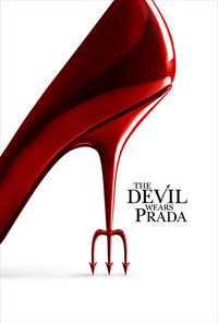
- The Devil Wears Padding
- The padding is the space inside an element, between its content and its border. In this list, the padding is the gap between the grey border and the text.
- The Empire Strikes Block
- A block-level element is one that starts on a new line and reserves the full width available, like a heading or a paragraph.
- Git Out
- Git is a version control tool used to track changes in source code. It’s the industry standard for managing web development projects.
- Gridiator
- CSS Grid is a layout system for arranging elements in rows and columns. Unlike Flexbox, which is one-dimensional, Grid is designed for two-dimensional layouts.
- Hidden <Figure>
- The
<figure>element is used to show an image with a caption, while thehiddenattribute tells browsers not to render a specific element on a page.- Interstyler
- The
<style>element is used to embed CSS rules directly in an HTML page. These rules are colloquially referred to as “styles”.- The Margin
- The margin is the space outside an element, the gap between it and its neighbours. In this list, the margin is the gap between the grey border and the text above it.
- vh for Vendetta
- The viewport is the visible area of a web page in your browser. The
vhunit stands for viewport height, where1vhis equal to 1% of the screen's height.
I’m pretty happy with this list, and with the amount of variety and wordplay I managed to fit into a dozen titles.
Top Pun: choosing the movie titles
The trick to writing good puns is to write lots of puns, then throw away the bad ones. I only needed a dozen movies, but I had over thirty other titles that I didn’t use.
If the puns aren’t coming immediately, I write two lists: the phrases or words I want to parody, and the words I’m trying to shoehorn in. In this case, the first list had phrases like X-Men or Mission Impossible, and the second had words like pixel, margin, and flex.
This is where I reach for search engines – I won’t find anybody else making the exact puns I want, but I can find pre-existing lists of these building blocks. In this case, I looked at lists of famous and iconic films, and I read web development tutorials and glossaries. I leant toward popular films so more people would get the reference; a pun on an obscure film would likely be missed.
As I build the two lists, I start to spot connections, like the fact that X-Men could become Flex-Men. I write down all my ideas, even the bad ones – often a bad idea is the jumping off point for a good one. For example, an early idea was Block to the Future, which isn’t very good, but later I realised I could use Back/Block for The Empire Strikes Block instead, which is much better.
If this was a purely text-based exercise, the titles would be enough – but I also needed posters.
Blurhemian Rhapsody: making the posters with Primitive
I needed some posters to go with the titles, but what to use?
I wanted to use the movie posters because many films have iconic posters, and that would help people recognise the pun – but I didn’t want to use the real movie posters, because they often show the title. That would contradict my text, not help it.
But I do have an image editor, and while I lack the Photoshop skills to replace the title in a convincing way, I can make text that looks okay if you squint – and that gave me an idea.
Several years ago, I used Michael Fogleman’s Primitive tool to create some wallpapers. Primitive redraws images with a simple geometric shapes, adding one shape at a time, trying to get closer and closer to the original image.
Here’s an example, in which my face has been redrawn as several hundred triangles:


This gives a recognisable version of the image, but it’s a distinct style and you won’t mistake it for the real thing.
For each movie I was considering, I downloaded a poster from The Movie Databaase, and I used Primitive to blur it. Sometimes the original title would appear through the blur, in which case I used an image editor to replace the title and re-blurred it. The blurring meant I could get away with a rough edit – for example, I didn’t need the exact font – because any imperfections would be blurred away by Primitive.
This added a new dimension to my search for puns – I wanted movie posters that would still be recognisable after this blurring. This ruled out posters that are very busy, because it’s difficult to distinguish individual elements after the blurring. I looked at lists of iconic movie posters, which often have clear, distinct shapes that hold up well when converted into triangles.
One of the best examples of an iconic poster is The Devil Wears Prada. I know nothing about the film, but I remember the poster with the big red heel. When you blur the poster with Primitive, it becomes recognisable almost immediately. This is what it looks like with 5, 25, and 50 triangles:


I had a year where all my desktop wallpapers were photos that I’d blurred using Primitive, and I’ve been waiting for a chance to use it in a bigger project. I’m really pleased with the result – it lets me lean into the titles I’ve created, and it gives the whole collection a coherent appearance.
Widening the Lens: choosing a more diverse selection
I picked a dozen movies and started writing the article. But as I was taking screenshots of the movie grid, I noticed that my initial selection wasn’t very representative. Ten of the twelve films had all-or-mostly men in the main roles, and all of the lead characters were white.
I was tempted to ignore this problem, because this is just a fake collection for a blog post and does it really matter? But that was disingenuous – I cared enough to put in all this effort, so it must be a meaningful selection to me. I wanted a more diverse and interesting selection.
I looked for lists of famous movies which centre women and non-white characters, and added several to my made-up collection. Ideally I’d also have some movies that centre queer or disabled characters, but I couldn’t find any with an iconic poster or a pun-worthy title.
Blooper Reel: the movies I didn’t use
I made a lot of puns and posters, including a couple of personal favourites that I cut from the post:
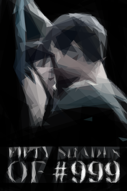
Fifty Shades of Grey became Fifty Shades of #999 and was the first movie where I considered replacing a colour with a hex code. I swapped this out for The Colour Purple when I was trying to create a more diverse list, and replacing a mostly-grey poster with a pop of colour helped too.
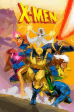
X-Men became Flex-men, and I’m really sad I couldn’t use that pun. This was let down by the poster – the original X-Men branding is very prominent and would be hard to change, and all of the colourful X-Men posters are very busy with lots of characters.
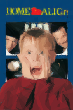
Home Alone became Home Align, which is a weaker pun but another easily-recognisable poster.
I had good reasons to cut all of them, and the selection is better off without them – but maybe they’ll reappear in a future post.
Why would you do this?
This is a lot of effort for placeholder data in a single blog post. I did it because it was fun, and it helped me enjoy writing the rest of the post. Every time I thought of another title or saw a poster in a screenshot, it made me smile. That’s enough of a reason.
This sort of fun detail is why I like having a personal blog which isn’t a business or an income stream. I write because I enjoy it, and I can make decisions that don’t make commercial sense because it’s not a commercial website. This side quest had terrible return on investment if you only care about time and money – but it was fantastic for joy.