Using perceptual distance to create better headers
For nearly a decade, the header of this website has been decorated with a mosaic-like pattern of coloured squares. I can choose a colour for individual posts or pages, and that tints the title, the links, and the header. It adds some texture and visual interest, without being too distracting.
The implementation is pretty straightforward: I have one function that generates the coordinates of each square, and another that generates varying shades of the tint colour. Put those together, and it draws the header image.
I recently improved the way I choose the shades of the tint colour, which makes the headers look more coherent, especially in dark mode. The change is subtle, but a definite improvement.
The old approach: varying the HSL lightness
Before, this is how I generated the shades:
- Map to HSL. Convert the tint colour to the hue-saturation-lightness (HSL) colour space.
- Define the bounds. I chose 7/8 and 8/7 of the original lightness, because it looked good in the first few colours I tried.
- Jitter lightness. Pick a random lightness value in this range.
- Recombine and convert. Pair this new lightness with the original hue and saturation, and convert back to sRGB.
I was trying to create colours which looked similar and varied only in lightness, so you’d see lighter or darker shades of the tint colour. My headers are PNG images, which are usually saved as sRGB, which is I why I convert back in the final step.
Here’s what the old code looked like:
require 'color'

# Given a hex colour as a string (e.g. '#123456') generate
# an infinite sequence of colours which vary only in brightness.
def get_colours_like(hex)
  seeded_random = Random.new(hex[1..].to_i(16))

  hsl = Color::RGB.by_hex(hex).to_hsl

  min_luminosity = hsl.luminosity * 7 / 8
  max_luminosity = hsl.luminosity * 8 / 7
  luminosity_diff = max_luminosity - min_luminosity

  Enumerator.new do |enum|
    loop do
      new_hsl = Color::HSL.from_values(
        hsl.hue,
        hsl.saturation,
        min_luminosity + (seeded_random.rand * luminosity_diff)
      )
      enum.yield new_hsl.to_rgb
    end
  end
end
I seeded the random generator so it always returned the same colours – this meant my local dev environment and web server would always generate identical header images. Note that it’s seeded based on the colour, so different tint colours will have light/dark squares in different places.
All the colour calculations are done by Austin Ziegler’s excellent color gem, which saved me from implementing colour conversions myself.
This approach is simple, but it has problems. Varying the lightness by proportion means the range varied from colour to colour – headers for dark colours didn’t have enough contrast, while light colours had too much contrast.
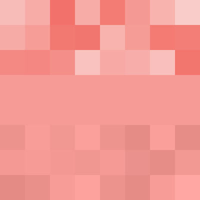
Here are three examples – notice how the dark header is almost solid colour, while the light header has enough contrast to become distracting:
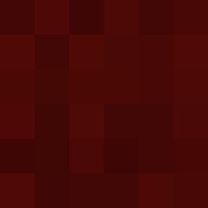

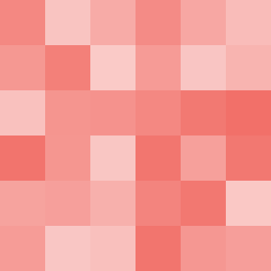
This heuristic worked for the first colour I tried (#d01c11, the site’s original tint colour) but it breaks down as I’ve added more colours, especially in dark mode.
I could replace the percentages with fixed offsets – for example, plus or minus 25% lightness – but this wouldn’t fix the problem. Humans aren’t machines; we don’t perceive colours as linear numerical values. The human eye is more sensitive to some colours than others, so the same numerical jump in HSL doesn’t feel like the same visual difference.
Let’s look at another example, where I’ll fix the hue and saturation, and step the lightness by 25%. These differences don’t feel the same:


There are alternative colour spaces like OKLCH and CIELAB which try to capture the nuances of human biology and how we interpret colours, and that’s where I looked at for a replacement.
The CIELAB colour space
The CIELAB colour space is based on opponent process theory, which suggests that we perceive colour as a battle of three opposing pairs: black vs. white, red vs. green, and blue vs. yellow. Think about how you never see a reddish-green or a blueish-yellow – these colours are opposites.
These three pairs give us the three coordinates in CIELAB space:
- L* is the perceptual lightness (black vs. white)
- a* is the red-green axis
- b* is the blue-yellow axis
(The other three letters stand for Commission internationale de l’éclairage, the standards body who developed CIELAB in 1976.)
Within this colour space, we can calculate the perceptual difference between two colours. Ideally, that numerical distance should match our human perception of the change. The goal is perceptually uniformity: if you move a fixed numerical distance anywhere in the space, the “amount” of change should feel the same to a human observer.
That’s much easier said than done: the measurement formulas (like Delta E) have been refined over decades, and deficiences have been found in CIELAB, especially for shades of blue. Newer spaces like OKLAB try to capture the nuances of human biology even more accurately. But for the purpose of my header images, CIELAB is good enough, and a big improvement over HSL.
One place I already use CIELAB is in my tool for extracting dominant colours. I’m using k‑means clustering to group colours that are “close” together, and it makes sense to measure closeness using perceptual distance.
The Ruby gem I’m using supports CIELAB but not OKLAB, which also informed my decision. Colour maths is complicated, and I’d rather use an existing implementation than write it all myself.
My new approach: varying the CIELAB perceptual lightness
Here’s my new heuristic:
- Map to CIELAB. Convert the tint colour to CIELAB space.
- Define the bounds. Choose a fixed distance, and find how much you need to increase/decrease the perceptual brightness L* to reach that distance.
- Jitter lightness. Pick a random L* value in this range.
- Recombine and convert. Pair this new lightness with the original a* and b* components, and convert back to sRGB.
To find the bounds, I do a binary search on the possible lightness values to find the perceptual lightness which gets me closest to the target distance.
If I’m looking for the lighter shade, I search the range .
If I’m looking for the darker shade, I search the range .
Here’s the code:
require 'color'

# Find the perceptual lightness of a CIELAB colour that's a specific
# perceptual difference (target_distance) from the original colour, while
# maintaining the original hue and colourfulness.
def lightness_at_distance(original_lab, direction, target_distance)
  # 1. Define the search range for L*
  if direction == 'lighter'
    low_l = original_lab.l
    high_l = 100
  else
    low_l = 0
    high_l = original_lab.l
  end

  # 2. Run a binary search on L*
  best_lab = original_lab
  best_delta = 0

  15.times do
    mid_l = (low_l + high_l) / 2.0

    candidate_lab = Color::CIELAB.from_values(mid_l, original_lab.a, original_lab.b)
    candidate_delta = original_lab.delta_e2000(candidate_lab)

    # Are we closer than the current best colour? If so, replace it.
    if (candidate_delta - target_distance).abs < (best_delta - target_distance).abs
      best_lab = candidate_lab
      best_delta = candidate_delta
    end

    if candidate_delta < target_distance
      # We need more distance, move away from the original L*
      direction == 'lighter' ? (low_l = mid_l) : (high_l = mid_l)
    else
      # We've gone too far, move back toward the original L*
      direction == 'lighter' ? (high_l = mid_l) : (low_l = mid_l)
    end
  end

  best_lab.l
end
Then I can write a very similar function to what I wrote for HSL:
# Given a hex colour as a string (e.g. '#123456') generate
# an infinite sequence of colours which vary only in lightness.
def get_colours_like(hex)
  seeded_random = Random.new(hex[1..].to_i(16))

  lab = Color::RGB.by_hex(hex).to_lab

  min_lightness = lightness_at_distance(lab, 'darker',  6)
  max_lightness = lightness_at_distance(lab, 'lighter', 6)
  lightness_diff = max_lightness - min_lightness

  Enumerator.new do |enum|
    loop do
      new_lab = Color::CIELAB.from_values(
        min_lightness + (seeded_random.rand * lightness_diff),
        lab.a,
        lab.b
      )

      # Discard colours which don't map cleanly from CIELAB to sRGB
      if new_lab.delta_e2000(new_lab.to_rgb.to_lab) > 1
        next
      end

      enum.yield new_lab.to_rgb
    end
  end
end
One gotcha is that CIELAB is a wider range than sRGB, so CIELAB colours don’t always map cleanly into sRGB. For example, certain bright colours like neon green may lose their vibrancy when converted from CIELAB to sRGB.
When it does the conversion, the color gem automatically clamps colours to fit into the sRGB space, but this creates some unusually dark or bright squares. I check if this clipping has occurred by converting back to CIELAB and looking at the distance – if there’s too much drift, I discard the colour and pick another. This is another subtle difference, but I think it improves the overall vibe.
Let’s look at the results, which compare the HSL heuristic (top), the original tint colour (middle), and the CIELAB heuristic (bottom):
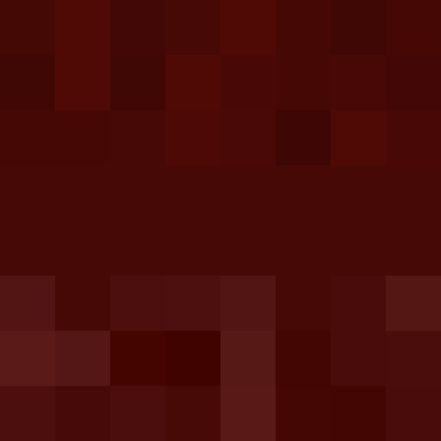
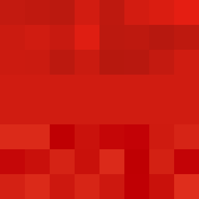
The dark squares have a bit more variety, while the light squares have much less and avoid the bright and noticeable shades. It’s a particular improvement in dark mode, where I always use light tint colours. There’s almost no difference for the middle colour, which makes sense because it was how I designed the original heuristic. It already looked pretty good.
The new colours are closer to what I want: a bit of subtle texture, not loud enough to draw attention. I switched to them a fortnight ago, and nobody noticed. It’s small refinement, not a radical change.