Cloning GitHub’s Contributions chart
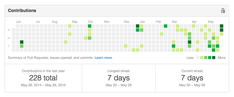
I’m a total sucker for gamification1. If you put a pretty chart in front of me to measure my progress, I fall for it every time. One place I’ve noticed this recently is with the Contributions graph on my user page on GitHub. This is a year-long calendar that shows a heatmap of all your activity. Here’s what mine looks like:

You can see that my activity started to pick up around March, which is when I started using GitHub at work. I was seeing this chart almost every day, and I began feeling guilty about the amount of blank space. So I’ve been trying to be more active – whether that’s on my own repos, or pull requests against other people’s work – and I think the change is noticeable.
The GitHub chart has been a particular effective motivator. I think it’s the long tail that does it: if I don’t do something now, I’ll be looking at the blank space for another year. So it got me wondering, could I use this design for something else?
I had a look to see if I could simply repurpose GitHub’s existing code, but it’s some sort of complex HTML5 canvas object. It goes right over my head, so I couldn’t use that. I had to write my own implementation.
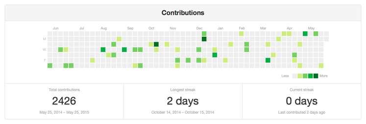
My web dev skills aren’t great, but I came up with a rough approximation:

It’s rendered entirely in plain HTML and CSS. There are also tooltips (if you hover over a calendar cell, it shows how many contributions you made that day), which I tried in JavaScript, but the performance was awful. It’s not a perfect clone, but it’s fine for my purposes.
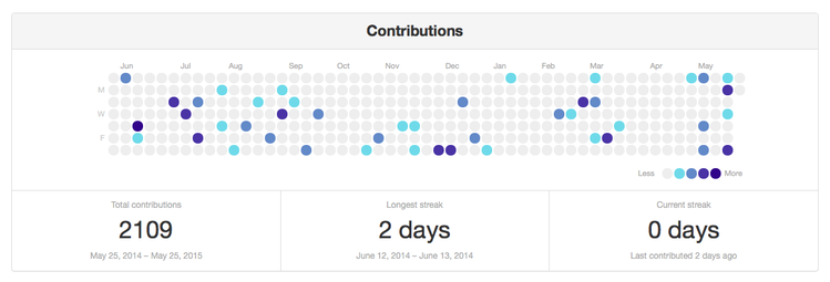
Modern CSS means that it’s fairly easy to change the look and feel of the graph. Here’s another look that I quite like:

This is accompanied by a Python script that takes a simple plain text file recording “contributions”, and returns the HTML. All the code is on GitHub, along with instructions and an example.
I have a few more ideas for some cosmetic tweaks, but it basically works. Now all I have to do is decide what I want to track.
The gamification of physical activity is one of the few reasons I’ve become interested in the Apple Watch (although not enough to buy one). I was thinking of it only as a device for notifications; I find the fitness aspects much more intriguing.
This may be driven by some recent surgery. I was stuck in bed, unable to do anything physically intensive, while reading about people doing exercise with their new Watches. I’m sure my desire for the former rubbed off on the latter. ↩