About the site
I bought the domain name alexwlchan.net on 8th November 2012, and I’ve been writing here ever since.
I’ve always built this site using a static site generator. I write my posts in Markdown text files, then I have a tool that converts those inputs into a folder full of HTML files. I upload that folder to a web server, and then you can browse them on the web.
Currently I build the site using Jekyll, and my web server is a virtual machine hosted by Linode which is running Caddy. I use my own theme – I wrote all the CSS and templates by hand. The source code is on GitHub, and changes to the site are automatically deployed with GitHub Actions.
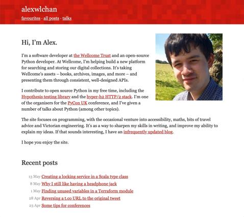
I’m constantly making little tweaks and refinement to the site’s appearance, and below you can see some of the past designs. Looking back, what strikes me is how quickly I nailed the basic design. By 2016, I had the layout I’m still using today – a coloured header with a mosaic texture, tint colours throughout each page, and a vertical layout.
Mid 2022 to present: The coming of cards
In 2022, I introduced cards to make articles look more visually interesting than a collection of text links. This was part of a design refresh to make it easier for new visitors to find posts they might like in the backlog. You can see how these cards first looked on the homepage:
It took me a while to refine the design of the cards – for example, switching to images with non-white backgrounds to give a clear gap between image and text, but the basic idea has stuck.
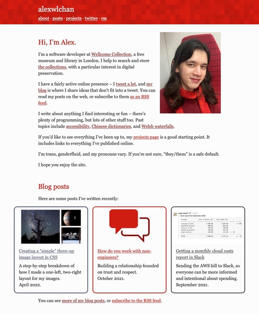
2018 to mid-2022: A homepage bio and custom colours
Until 2018, the homepage was a scrolling list of my recent posts. This makes sense if you report on current affairs or news, but it doesn’t make sense for me, and it made it difficult to find older writing. If I’d just written a really long post, you might never see anything else!
I replaced the homepage with a bio and a profile picture, with links out to blog posts but not jumping straight into the content.
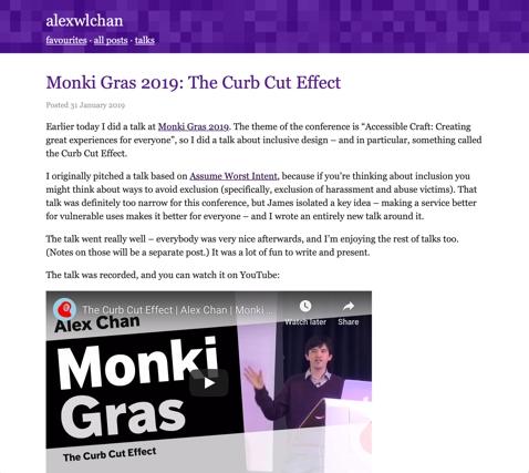
I also added a way to customise the tint colour of pages, for example, here’s one in purple:
2016: The magic of mosaics
The design didn’t change much, but I kept trying to reduce the vertical size of the header. I like using small phones, and I wanted the header to be as small as possible, so you could see more of the main article on the initial page load.
This is when I added the mosaic background to headers, as a bit of lightweight visual interest. I’m still using them on the site today!
Late 2014: The first red stripe
This is the first time I wrote my own templates and CSS, rather than using somebody else’s template. I ditched the sidebars in favour of a bold red header at the top of the page.
Although I’ve made a lot of tweaks, this is still the same basic design I use today – a brightly coloured header with a few links, a tint colour used through the page, and content presented vertically with no sidebars or horizontal elements.
The screenshot above looks a bit dated, but I can see the bones of the current design.
Early 2014: A short-lived sidebar phase
The second new design switched to another new template, with some new fonts and a short-lived sidebar. I’ve never been sure what to put in my sidebar – it seems a waste of space not to put anything there, but I want it to be sparse so as not to distract from the content.
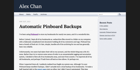
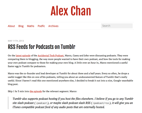
2013: A big name redesign
The first new design switched to a red-and-white theme which is very similar to the palette I’m still using. This was based on Lucas Lew’s Whitespace theme.
I wrote my name in very large text, which looks faintly ridiculous in hindsight.
Late 2012: Original Octopress
The original site used a lightly modified version of the default Octopress theme. It was in blue for a while, and I’m pretty sure it was in red too, but I didn’t keep any screenshots.