Control Centre: one step forward, two steps back
I’m not much of an iOS power user, and these days, most new features go straight over my head. As such, there wasn’t much in iOS 11 to interest me, and it took me a while to get round to upgrading.
One thing I was looking forward to was the new Control Centre. The ability to customise controls could come in handy, and doing away with the separate pages seemed like an easy win. Plus, I think the new version just looks nicer.
Now I’ve been using it for several weeks, I’m more ambivalent. Customisation has been really useful — I’ve done away with the unused calculator shortcut, and brought in Low Power Mode, which I use all the time. Most of the buttons look good and are easy to hit, and I’m having much more success with the chunky brightness and volume sliders. But as it advances in one area, so it slips in another. I have two big problems with the new Control Centre.
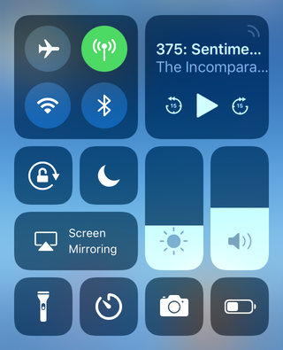
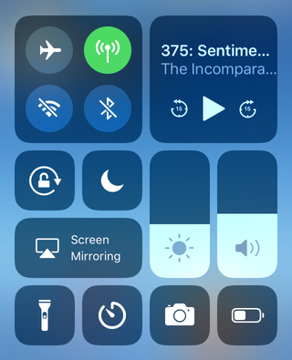
My first issue is one that’s already been widely reported. Pop quiz: in the screenshot below, are Wi-Fi and Bluetooth turned on or off?

On iOS 10, toggling those buttons would turn off WiFi or Bluetooth. On iOS 11, they don’t.
These buttons just control whether your device will accept new connections. And even worse, the settings are only transient. They re-enable if you restart your phone, or wait until 5am the following day. Apple has a support document explaining the weird edge cases. If you want to turn off WiFi or Bluetooth, you have to go to the Settings app — just the sort of roundabout action Control Centre was meant to avoid.
I think this is a bad change. Potential security implications aside, it’s not how you expect those buttons to work. The button presents a binary switch, so you expect it to toggle distinct states. “On”/”Off” and fit the button nicely. “On”/”On but with an asterisk” is a much more subtle distinction. It could work if this was a three-way switch with “Off” as another state — but that’s not what we have.

I routinely turn on power saving features to conserve battery life. In iOS 10, I’d go to the Settings app to enable Low Power Mode, and turn off my WiFi and Bluetooth radios from Control Centre. In iOS 11, it’s the other way round. Turning off those radios routinely got me an extra hour of battery, or more. I thought Apple had recognised the need for easier power management by making Low Power Mode available in Control Centre, but the WiFi/Bluetooth changes take it in the other direction.
My second issue is with the media controls. Previously, Control Centre was split into two screens — media controls on one, everything else on the other. It was very common to open to the wrong screen, and need a swipe to get to what you wanted. Because iOS 11 puts everything on one page, it’s easier to get to, right?
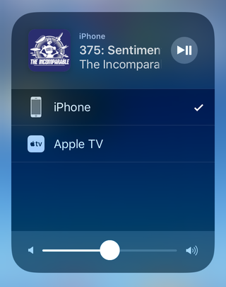
But the new design only gives the controls half the screen width, and the controls are too small for me to hit accurately. So if I want to pause playback, I have to tap the corner for the expanded controls. But first, I’m taken to a screen where I can select my audio output:

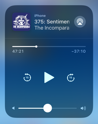
It’s another tap before I can get to the media controls, which are then rendered at a comically small size:

The separate panes of Control Centre have been replaced with separate panes of the media control. And it never remembers which pane I was on — I never change my audio output, I always want the playback controls, but I have to tap through each time.
These are small frustrations, but they’re ones I hit multiple times a day. In both cases, it feels like Apple has identified a problem with the old Control Centre, and tried to fix it — but in doing so, made it worse in a different way. Unfortunately, this feels like the new norm with a lot of Apple’s consumer software.