One of the changes at this year’s PyCon UK was that I printed a bunch of signs for the venue. I talked about this in my post on inclusive conferences, but I’d never actually done it!
Overall the signs have been very well received – people have said some very nice things, they’ve been helpful, and the production mostly went off without a hitch. We got a lot of stuff right off the bat:
Bright, clear signage
A sign for every room where we were running sessions
But this was a first attempt, and inevitably I didn’t get it all right – for the benefit of my future self, and anybody else making venue signage, here’s a few of the things I’ve learnt this year.
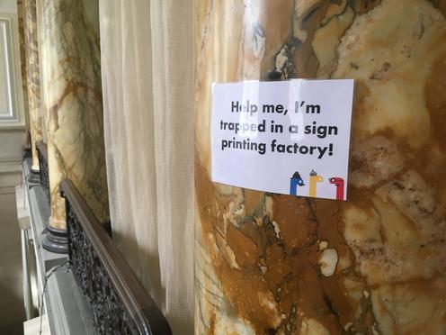
#PyConUK "Help me, I'm trapped in a sign printing factory!"
Make the font size bigger
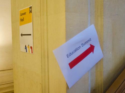
I printed all of our signs on A4, using my home/work printers. They were laminated before we stuck them up on the walls, to give them a bit of extra sturdiness.
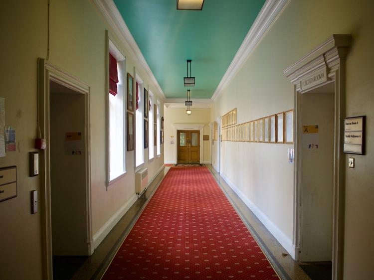
On my desk, A4 signs seemed more than adequate – large, even. But once they were up on the wall, they seemed quite small, and they didn’t stand out as much as I’d hoped. In the picture below, a glance down the corridor doesn’t tell you much – doubling the size to A3 (or even bigger in some cases!) would have been a big improvement in legibility.
Looking down a corridor at Cardiff City Hall. Barely visible are the signs for the lift (left), room A (right), and room D (at the end).
Next year I want to print the signs on A3 at a minimum, and have them printed professionally too. There’s a white gap around the edges where my printer cuts off, and true edge-to-edge printing would look nicer.
We’ve also talked about having an even larger, sandwich-board type arrangement that says “Welcome to PyCon UK!”.
Make it easy to print more of them
We forgot several signs (in particular, the lift!) and had mistakes on several others (one set of arrows went in the wrong direction). A few signs went walkabout during the conference. And there were signs we didn’t need, but it was nice to be able to make them for fun.
We had a printer and a laminator to hand, and I’d brought the design files on my laptop, so printing extra signs was quite easy.
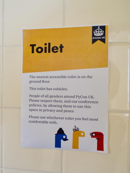
A hastily reprinted sign in one of the toilets (the original signs mysteriously disappeared overnight). Note the lack of lamination! The sign reads: “The nearest accessible toilet is on the ground floor. This toilet has cubicles. People of all genders attend PyCon UK. Please respect them, and our conference policies, by allowing them to use this space in privacy and peace. Please use whichever toilet you feel most comfortable with.”
Have some fun
The purpose of signs is wayfinding, but that doesn’t mean you can’t inject some character. We had at least three “fun” signs around the venue (Ana found one of them above), and some of the other signs had humourous captions. On the arrow signs, the snakes all turn to face the direction of travel.
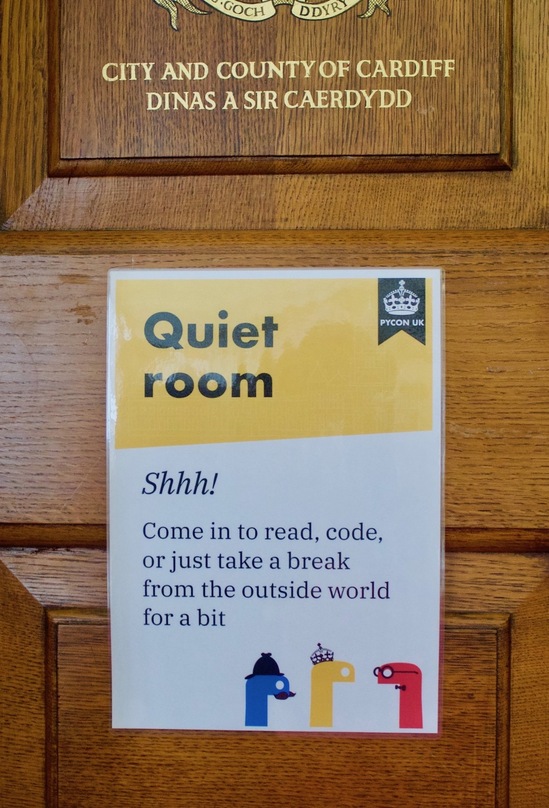
The sign for the quiet room. The caption reads: Shhh! Come in to read, code, or just take a break from the outside world for a bit.
Consistency matters!
The signs for the Young Coders day didn’t match the rest of the PyCon UK signs, and we had a couple of people who were a bit confused – they weren’t sure if those signs were part of the same event.
By the time we realised it was an issue, it was a bit late – there wasn’t time to reprint them as everyone was arriving. One to consider for next year – be much more careful about other signage that’s going up and part of the same event.
Are these both signs for the same event?
Bonus entry: have a way to do short-term customisations
There were a few times where it would have been useful to modify the sign. For example:
“The talk scheduled in room X is now in room Y”
“The session in room Z has been cancelled”
“This room is full, please go to a different session”
And I think speakers/workshop coordinators might have liked being able to write the name of their talk on the sign, so people knew they were in the right place!
We only had permanent markers, so there was no way to write on a sign without leaving it there for the entire conference. I think whiteboard markers would probably do the trick, as the lamination would allow them to be rubbed off – we just never had time to try it.
The high-tech solution would be to have screens for all the signs, but our budget doesn’t stretch that far!
To next year!
I’ve very happy with how this year’s signs turned out, and I think they’ve more than proven their value.
If I’m still helping out next year, I’d love to go back and do it even better – professional printing, bigger text, even more signs.