An AWS costs graph that works for me
If you use AWS, it’s always a good idea to keep an eye on your costs. It’s easy to start spending lots of money inadvertently, or waste money because of some inefficient configuration, and then you get a nasty surprise when your bill arrives. I like to have a quick glance at our bill every month or so, just to check for unexpected spikes or changes.
Amazon have a service called Cost Explorer with lots of graphing and reporting tools to slice your bill in different ways. I have a Python script that opens a graph that I find useful:
#!/usr/bin/env python
# -*- encoding: utf-8

import datetime as dt
from urllib.parse import urlencode, urlparse, urlunparse
import webbrowser


today = dt.datetime.now()

query_dict = {
    # Look at costs for the last thirty days
    "startDate": (today - dt.timedelta(days=30)).strftime("%Y-%m-%d"),
    "endDate": today.strftime("%Y-%m-%d"),
    "timeRangeOption": "Custom",

    # Break down costs by day
    "granularity": "Daily",

    # Line chart of API operation costs
    "chartStyle": "Line",
    "filter": '[{"dimension":"Operation","values":[""],"include":false,"children":null}]',
    "groupBy": "Operation",

    # Give it a nice title
    "isTemplate": "true",
    "reportName": "Daily API operation costs",
    "reportType": "CostUsage",
}

parts = [
    # scheme
    "https",

    # netloc
    "console.aws.amazon.com",

    # path
    "/cost-reports/home",

    # params
    "",

    # query
    "",

    # fragment
    "/custom?%s" % urlencode(query_dict)
]

webbrowser.open(urlunparse(parts))
All of the Cost Explorer settings can be configured as URL query parameters. This script sets those query parameters, creates a URL and then asks my web browser to open the page. Assuming I’m logged in to AWS, I see a graph like this:
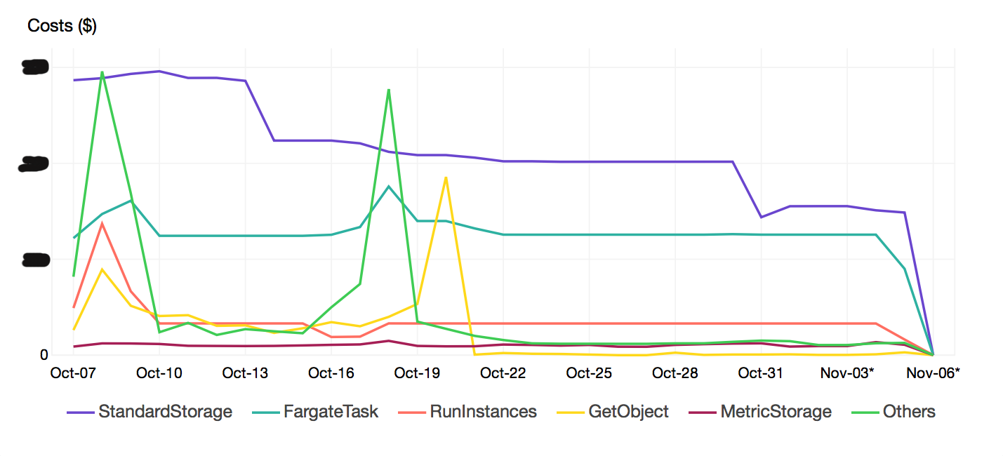
This is a line graph of our most expensive API operations over the last 30 days.
The line graph makes it easy to pick out trends (as opposed to the alternative, a stacked bar chart). For example, I can see there was a big spike in GetObject calls in middle of October. If I wasn’t expecting that, it’s a cue to do some digging, and find out why that cost was higher than usual.
About a year or so ago, checked this graph saved us a lot of money. We’d set up some new VPCs with a NAT Gateway, and all our AWS traffic was going through the NAT Gateway, via the public internet. You pay per gigabyte of data transferred through a NAT Gateway – so it pretty expensive! Because we spotted the sudden spike upwards, and we knew what change we’d just made, finding the cause wasn’t hard. We realised we had to set up VPC endpoints, which are much cheaper.
You can fill lots of spreadsheets and scripts with numbers from your AWS bill, and analyse it in dozens of ways – but a picture speaks a thousand words, and for a quick glance, that’s more than enough.