Storing language vocabulary as a graph
If you’ve ever tried to learn a foreign language, you’ve probably encountered a vocabulary list. It’s a list of words and phrases, accompanied by a translation into a language you already know.
Here’s an example with English and German:
This is an efficient way to store the data, and it allows for fast lookups if there’s a word you don’t know. (Assuming you know how to find a word in the list.) It’s how every dictionary and phrase book I’ve ever read has been laid out.
A vocabulary list treats each word/translation pair as a discrete unit, to be learnt individually. But I don’t learn words in isolation – my brain forms connections between related words, and remembering the connections helps me remember the words. Sometimes these connections are very obvious and explicit; sometimes they’re a weird quirk of my brain.
For example, in Chinese, the word 电 (electricity) appears in a number of other words. A 电话 (electric words) is a telephone. A 电视 (electric looking) is a television. A 电车 (electric vehicle) is a tram. You could learn all three words separately, but I find it easier to remember them together.
One way to represent connections between related objects is to use a graph (as in graph theory, not as in charts). We can apply this idea to vocabulary: each phrase is a vertex, and two phrases are connected by an edge if they’re related in some way. Here’s the graph for 电:
Rather than learning the four words individually, I can learn this mini-cluster, and remember them together. Having the narrative that connects them makes it easier for them to stick in my brain.
I connect words in all sorts of ways, including:
- If they have a common component or root (such as 电–, above)
- If they have a related meaning (such as words for family members, or directions, or modes of transport)
- If they trigger a shared memory (I have fragments of Slovenian tied together by a holiday to Ljubljana)
The exact connections are unimportant; what I find interesting is the general idea of modelling vocabulary as a graph.
Normally, when I draw these graphs, I work on a fairly small scale. I imagine the connections between a handful of words, usually starting from a single word and listing words it’s connected to. The graph forms a star shape, like the example above. If we were to draw out the graph of all the vocabulary I know, we’d get something much bigger and more complex.
Wouldn’t it be interesting to see that bigger graph? What new connections or associations might I find if I could see everything together?
I’ve been thinking about this idea for a while, and over the last week I’ve done some experiments to try to pull such a graph together.
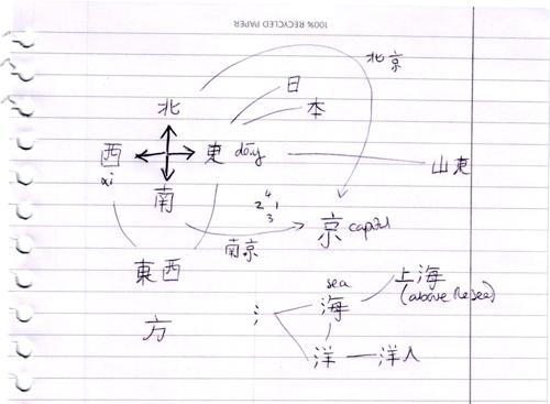
I usually sketch little graphs on scrap paper during a lesson, as a way to remember the words in the lesson. That works well on a small scale, but you can see it’s already getting a bit messy: lines are overlapping, phrases are getting boxed in, and I’m running out of room on the paper.

I wanted to see if drawing this graph digitally would be any better: in theory, a digital canvas makes it easier to rearrange the graph, and it can extend forever.
There are two parts here: I need to be able to store the graph data (the words and their connections), and then to render that data as a picture. I found some libraries to do the hard bits:
networkx is a Python package for creating and manipulating data about graph networks. It has a good API and excellent documentation.
D3.js is a JavaScript library for creating data visualisations, including network graphs. I found a few examples online, which I took and adapted to display my vocabulary graphs.
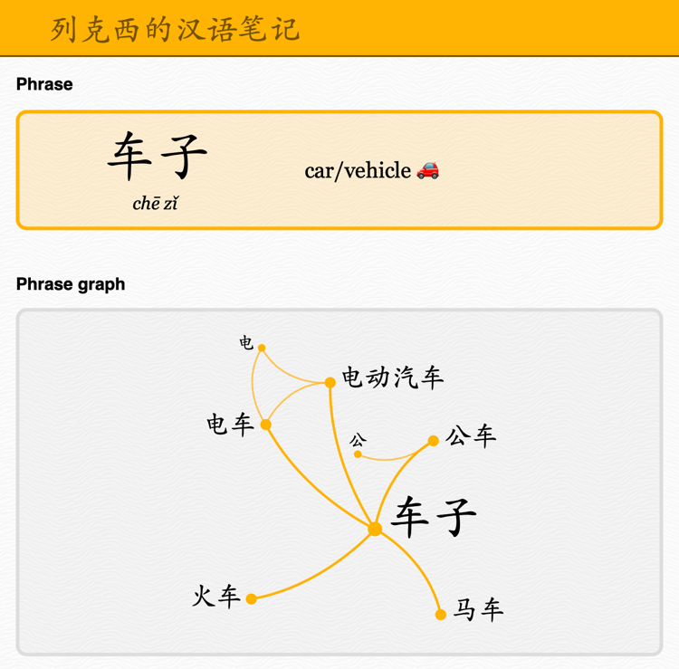
I wrapped these two libraries in a web app using Flask, and then added some words to see how well it works. That gives me a page that shows me a phrase and everything that is either directly related or one step away:

The graph is interactive: I can click on a phrase to jump to it, and see a graph with its related phrases. I can explore the vocabulary by using the graph.
I’d underestimated the complexity of drawing a graph that looks nice – when D3 renders the graph, it often shows something with lots of overlapping lines. You should be able to rearrange vertices to get a more pleasing pattern, but I’ve broken something and dragging only works intermittently.
When I started, I wanted to see the entire graph at once. It’s very messy and unwieldy in D3 – I still like the idea, but it needs more work to be usable. Nonetheless, in its current form, this works well as a way to store the entire graph, and it’s useful to see the subset of the graph centred on a particular phrase. I can imagine myself redrawing that on paper, both to get a prettier graph and to help reinforce the knowledge.
If you want to play with the graphs, visit chinese-vocabulary-graph.glitch.me
The code for the experiment is on GitHub (github.com/alexwlchan/vocabulary-graph), although it’s pretty rough – this is a prototype, not a production app.
I’m sure this isn’t a new concept – if nothing else, I have sketches of similar graphs from school exercise books, and that’s over a decade ago. But I’m not a cognitive scientist or a linguist, I don’t know anything about these fields, and I’ve struggled to find anything that sounds similar on Google. If there are other examples, I don’t know where to find them.
I don’t know if this wil go anywhere. I might keep updating the app with more words, or I might leave it to wither, but either way this was a fun experiment. I feel there’s a valuable idea here, even if the execution needs some polish.
There’s definitely something useful in organising information as a graph. I’d heard people use the term “knowledge graph” in the past, but the meaning and value hadn’t really clicked until now. Long-term, the biggest benefit I get from this experiment might not be a better vocabulary tool, but a better way to store general information and notes.