An unexpected lesson in CSS stacking contexts
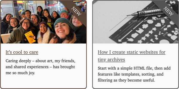
I’ve made another small tweak to the site – I’ve added “new” banners to articles I’ve written recently, and any post marked as “new” will be pinned to the homepage. Previously, the homepage was just a random selection of six articles I’d written at any time.
Last year I made some changes to de-emphasise sorting by date and reduce recency bias. I stand by that decision, but now I see I went too far. Nobody comes to my site asking “what did Alex write on a specific date”, but there are people who ask “what did Alex write recently”. I’d made it too difficult to find my newest writing, and that’s what this tweak is trying to fix.
This should have been a simple change, but it became a lesson about the inner workings of CSS.
Absolute positioning and my first attempt
I started with some code I wrote last year. Let’s step through it in detail.
First, create a container that includes both the image and the banner.
<div class="container">
  <div class="banner">NEW</div>
  <img src="computer.jpg">
</div>
Notice how the banner and image appear separately – they both have their own space in the layout.

I can add a CSS rule that makes the text appear on top of the image:
.banner {
  position: absolute;
}
This enables absolute positioning, which removes the banner from the normal document flow and allows it to be placed anywhere on the page. Now it sits alone, and it doesn't affect the layout of other elements on the page – in particular, the image no longer has to leave space for it.
The text is in the top left corner of the image, but we can move it to the top right-hand instead:
.container {
  position: relative;
}

.banner {
  transform: rotate(45deg);
  right:     16px;
  top:       20px;
}I chose the transform, right, and top values by tweaking until I got something that looked correct. They move the banner to the corner, and then the transform rotates it diagonally.
The relative position of the container element is vital. The absolutely positioned banner still needs a reference point for the top and right, and it uses the closest ancestor with an explicit position – or if it doesn’t find one, the root <html> element. Setting position: relative; means the offsets are measured against the sides of the container, not the entire HTML document.
This is a CSS feature called positioning context, which I’d never heard of until I started writing this blog post. I’d been copying the position: relative; line from other examples without really understanding what it did, or why it was necessary.
(What made this particularly confusing to me is that if you only add position: absolute to the banner, it seems like the image is the reference point – notice how, with just that property, the text is in the top left-hand corner of the image. It’s not until you set top or right that the banner starts using the entire page as a reference point. This is because an absolutely positioned element takes its initial position from where it would be in the normal flow, and doesn’t look for a positioned ancestor until you set an offset.)
Let's apply a colour to make this banner easier to read – the text is disappearing into the image.
.banner {
  background: red;
  color:      white;
}
Right now the element is only as big as the letters in the word “NEW”, so it’s just floating in space – we need to make it wider, so it covers the whole corner.
We can make it wider by adding padding. Because this changes the size of the element, I had to adjust the position offsets to keep it in the right place.
.banner {
  right:   -34px;
  top:     18px;
  padding: 2px 50px;
}Now the banner is too wide, and extending off the end of the image. Let’s clip the edges, so it fits neatly within the square:
.container {
  overflow: hidden;
}
This is the banner effect I’m looking for – the text is clear and prominent on the image. I’ve added a box-shadow on my homepage to make it stand out further, but cosmetic details like that aren’t important for the rest of this post.
As a reminder, here’s the HTML:
<div class="container">
  <div class="banner">NEW</div>
  <img src="computer.jpg">
</div>
and here’s the complete CSS:
.container {
  position: relative;
  overflow: hidden;
}

.banner {
  position: absolute;

  background: red;
  color:      white;

  transform: rotate(45deg);

  right:   -34px;
  top:     18px;
  padding: 2px 50px;
}
It’s only nine CSS properties, but it contains a surprising amount of complexity. I had this CSS and I knew it worked, but I didn’t really understand it – and especially the way absolute positioning worked – until I wrote this post.
This worked when I wrote it as a standalone snippet, and then I deployed it on this site, and I found a bug.
(The photo I used in the examples is from Viktorya Sergeeva on Pexels.)
Dark mode, filters, and stacking contexts
I added dark mode support to this site a couple of years ago – the background changes from white to black, the text colour flips, and a few other changes. I’m a light mode person, but I know a lot of people prefer dark mode and it was a fun bit of CSS work, so it’s there.
The code I described above breaks if you’re using this site in dark mode.
What.
I started poking around in my browser’s developer tools, and I could see that the banner was being rendered, but it was under the image instead of on top of it. All my positioning code that worked in light mode was broken in dark mode. I was baffled.


I discovered that by adding a z-index property to the banner, I could make it reappear. I knew that elements with a higher z-index will appear above an element with a lower z-index – so I was moving my banner back out from under the image. I had a fix, but it felt uncomfortable because I couldn’t explain why it worked, or why it was only necessary in dark mode. I wanted to go deeper.
I knew the culprit was in the CSS I’d written. I could see the issue if I tried my code in this site, but not if I copied it to a standalone HTML file.
To find the issue, I created a local branch of the site, and I started deleting CSS until I could no longer reproduce the issue. I eventually tracked it down to the following rule:
@media (prefers-color-scheme: dark) {
  /* see https://web.dev/articles/prefers-color-scheme#re-colorize_and_darken_photographic_images */
  img:not([src*='.svg']):not(.dark_aware) {
    filter: grayscale(10%);
  }
}
This applies a slight darkening to any images when dark mode is enabled – unless they’re an SVG, or I’ve added the dark_aware class that means an image look okay in dark mode. This makes images a bit less vibrant in dark mode, so they’re not too visually loud. This is a suggestion from Thomas Steiner, from an article with a lot of useful advice about supporting dark mode.
When this rule is present, the banner vanishes. When I delete it, the banner looks fine.
Eventually I found the answer: I’d not thought about (or heard of!) the stacking context. The stacking context is a way of thinking about HTML elements in three dimensions. It introduces a z‑axis that determines which elements appear above or below each other. It’s affected by properties like z-index, but also less obvious ones like filter.
In light mode, the banner and the image are both part of the same stacking context. This means that both elements can be rendered together, and the positioning rules are applied together – so the banner appears on top of the image.
In dark mode, my filter property creates a new stacking context. Applying a filter to an element forces it into a new stacking context, and in this case that means the image and the banner will be rendered separately. Browsers render elements in DOM order, and because the banner appears before the image in the HTML, the stacking context with the banner is rendered first, then the stacking context with the image is rendered separately and covers it up.
The correct fix is not to set a z-index, but to swap the order of DOM elements so the banner is rendered after the image:
<div class="container">
  <img src="computer.jpg">
  <div class="banner">NEW</div>
</div>
This is the code I’m using now, and now the banner looks correct in dark mode.
In hindsight, this ordering makes more sense anyway – the banner is an overlay on the image, and it feels right to me that it should appear later in the HTML. If I was laying this out with bits of paper, I’d put down the image, then the banner.
One example is nowhere near enough for me to properly understand stacking contexts or rendering order, but now I know it’s a thing I need to consider. I have a vague recollection that I made another mistake with filter and rendering order in the past, but I didn’t investigate properly – this time, I wanted to understand what was happening.
I’m still not done – now I have the main layout working, I’m chasing a hairline crack that’s started appearing in the cards, but only on WebKit. There’s an interaction between relative positioning and border-radius that’s throwing everything off. CSS is hard.
I stick to a small subset of CSS properties, but that doesn’t mean I can avoid the complexity of the web. There are lots of moving parts that interact in non-obvious ways, and my understanding is rudimentary at best. I have a lot of respect for front-end developers who work on much larger and more complex code bases. I’m getting better, but CSS keeps reminding me how much more I have to learn.