Adjusting the dominant colour of an image
A week ago, I was at a “book dash” (a collaborative writing event) for the Turing Way, a book about reproducible data science. As part of the day, we had an illustrator from Scriberia creating some drawings for the book. You can get an idea of what the illustrations look like by browsing the images from a previous book dash, which are published under a CC BY license.
One of my favourite images from that set is one titled “readable code”, which shows an explorer trying to read hieroglyphs that represent unreadable, confusing code:
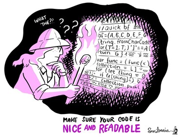
Like the other Scriberia illustrations in that collection, it’s black and white with a single accent colour – in this case, a pinky-purple.
If you’ve ever seen my talks or my selfies, you’ll know I like to match colours – maybe my slides will be green to match my outfit, or blue to match the conference theme, or I’ll wear red to match seats on a train.
Suppose I wanted to use this image in a slide deck: I’d want it to match the colour scheme on the other slides. This image would work equally well with plenty of other accent colours, so how do I change it if I want something different?
I’ve been adjusting the colours of images like this for a while. A couple of people saw me doing it on Thursday, and asked me how, so here’s my technique:
If the image is a JPEG, I use the Hue Adjust filter in the Mac image editor Acorn.
If the image is an SVG, I use a small Python script I’ve written. It looks for anything that looks like a hex colour string in the SVG XML (e.g.
#d01c11), converts it from RGB into HSL using the colorsys module, and copies the adjusted hex colour back into the SVG. It tries a range of hue adjustments, and saves them into a folder.If that sounds useful, this is the code:
adjust_hue_in_svg.py
import colorsys
import functools
import pathlib
import re
import sys


def adjust_hue(match, adjustment):
    hex_color_str = match.group(0)

    assert len(hex_color_str) == 7  #ff0000
    red = int(hex_color_str[1:3], 16)
    green = int(hex_color_str[3:5], 16)
    blue = int(hex_color_str[5:7], 16)

    hue, saturation, value = colorsys.rgb_to_hsv(red, green, blue)
    hue += adjustment

    red, green, blue = colorsys.hsv_to_rgb(hue, saturation, value)
    return '#%02x%02x%02x' % (int(red), int(green), int(blue))


if __name__ == '__main__':
    try:
        svg_path = pathlib.Path(sys.argv[1])
    except IndexError:
        sys.exit(f"Usage: {__file__} <SVG_PATH>")

    svg_text = svg_path.read_text()

    out_dir = pathlib.Path(svg_path.stem)
    out_dir.mkdir(exist_ok=True)

    # Look for anything that looks like a hex colour code, e.g. #ff0000
    color_matches = list(re.finditer(r"#[a-fA-F0-9]{6}", svg_text))

    # In the HSL colour model, colours are placed around a circle, and the
    # hue of a colour is the number of degrees around the circle.
    #
    # Because we don't know exactly what the target hue is, pick a spread of
    # angles to rotate around the hue circle, and save all of them.
    #
    # https://en.wikipedia.org/wiki/HSL_and_HSV
    #
    for degrees_adjustment in range(0, 360, 30):
        new_svg_text = svg_text
        out_path = out_dir / f"{svg_path.stem}_{degrees_adjustment}{svg_path.suffix}"

        new_svg_text, _ = re.subn(
            r"#[a-fA-F0-9]{6}",
            functools.partial(adjust_hue, adjustment=degrees_adjustment / 360),
            svg_text
        )

        out_path.write_text(new_svg_text)
With these two tools, I can get an image in a range of different colours:

Using the hue adjustment means I can find something in the right ballpark to match the rest of my slides. I might also tweak the saturation/brightness in an image editor if the shade isn’t quite right – and then I have an image to use in my slide deck.
You can see another example of this technique in the slides for my curb cut effect talk. There’s a picture of a handle on a purple door, but the original image had a red door. Without a side-by-side comparison, you’d never realise the image had been changed:
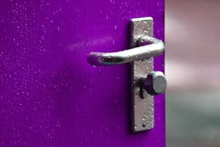 | 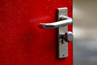 |
| modified image | original image |
It’s a small detail, but I always enjoy making my slides match this way.