Redesigning my archive pages
Last night, I updated the archive pages for my blog. On Twitter I teased it as a “design refresh” but it might be more accurate to call it a “first design” – the scrolling list of text links I had previously barely counts as a design.
If you click the “posts” link in the header, you’ll see something quite different to yesterday:
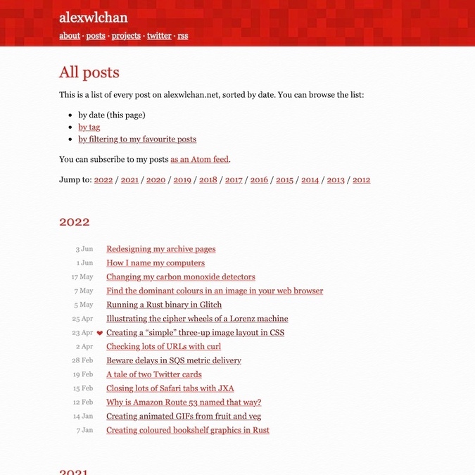
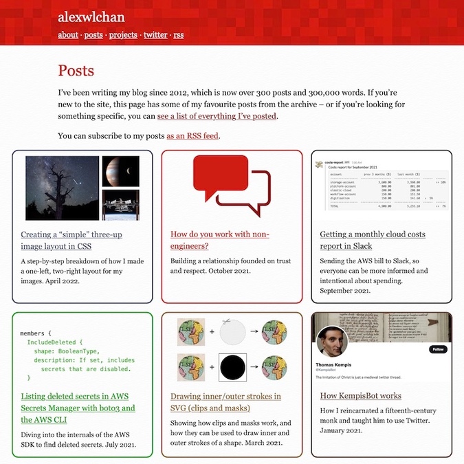
I’ve wanted to redesign that page for a while, but I kept putting it off because it seemed hard – once I started, it was much easier than I was expecting.
The problem of past posts
Most people find my site from search or via word-of-mouth. I think I’m doing pretty well for search – a lot of my posts are about solving specific problems, and if you search for that specific problem, my posts are near the top of the results. I have clear titles, relevant content, and my pages load quickly. Search engines can easily find their way around my blog. But people? Less so.
Every so often, somebody asks for a link to my blog, and I’m vaguely embarrassed to give it to them. It’s not because I’m ashamed of the blog – indeed, I think some of my best work is here – it’s because I know new readers don’t have a good experience. Given only a list of text links, it was hard for anyone to find something they’d want to read.
This especially stood out when the person asking wasn’t a programmer. They’d quickly assume it’s a programming blog, and that they weren’t “smart enough” to read it (yes, I’ve heard those exact words). There are lots of programming posts – but there are plenty of non-programming posts too! They’re just very difficult to find.
(The long list of links is useful for me – but I have a unique knowledge of my back catalogue. When I use it, I know exactly what I’m looking for. That list is still there, but now it’s buried a lot deeper because it’s not a good starting point.)
A while back, I started marking my favourite posts in the list of links. This was a half-hearted measure to improve discoverability, but clicking it only took you to a shorter list of text links. I’m also not sure anybody ever realised those hearts were clickable.
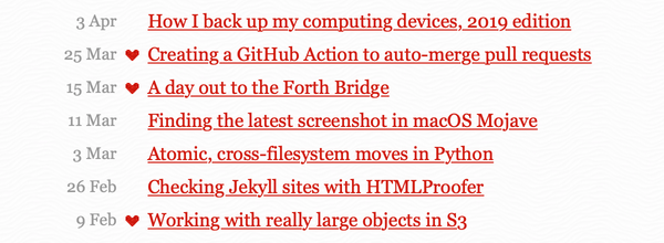
This is the kernel of a good idea – I have over 300 posts, and it’s unreasonable to expect anybody to choose from that many. Giving people a shorter list of “best” posts to choose from makes that easier, but it was still difficult to choose from that list of 40-odd posts when you only had the title.
I knew this wasn’t good enough, but I was struggling for ideas.
I thought about writing some sort of “start here” page for the site – a blog post that linked to other blog posts – but that’s just replacing one wall of text with another. I also kept putting off writing it, which doesn’t bode well for anybody wanting to read it.
I also thought about new tags and categories, but that’s still fiddling around the edges. I already have tags, but they’re hard to find. I wanted a more radical change.
Then after work yesterday, I had a brainwave – what if I used cards instead of links? This is a pretty common design pattern on the web; here are two examples from the Wellcome Collection website and my book tracker:
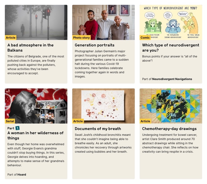
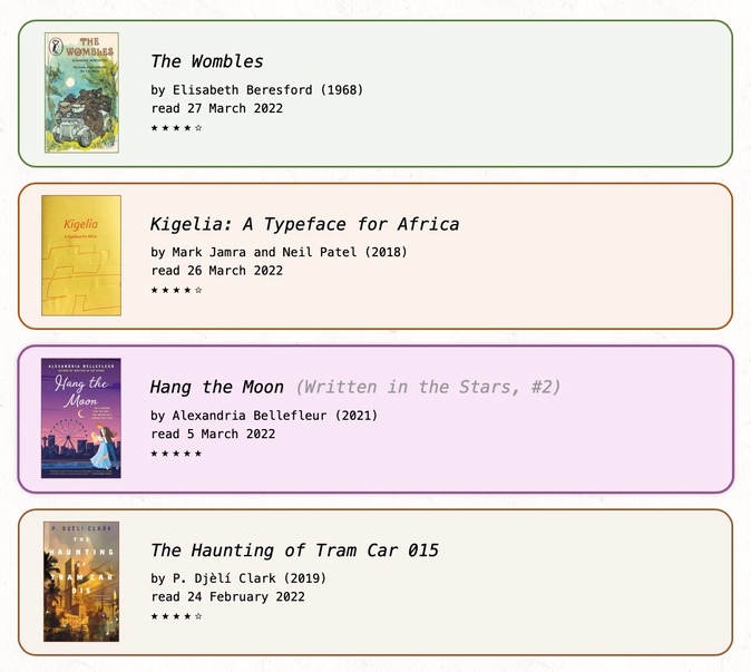
These are much better than a wall of text! The picture and description give more context about why somebody might want to read a given post, and they’re much more visually interesting. Ever since I made those cards for my book tracker, I’ve been jealous of how much better it looks than my main site, but I never thought to apply it here – until yesterday.
I grabbed my laptop, and started playing around. I quickly came up with something I liked, and which matches the style of the site:
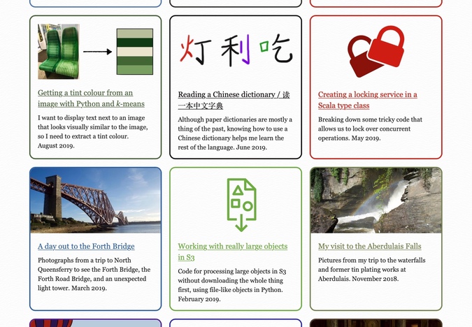
The “posts” link in the header now goes to this list of cards, and it’s only my favourite posts. Your first impression of the blog is now these rich, colourful cards – not a monotonous list of text links. It’s a smaller list of posts to read, and there’s more information to help you choose where to go next.
Update, 20 June 2022: I disliked this almost immediately, and I rolled it back. The “posts” link now goes to the “all posts” page, but the “best of” cards are more prominent, and there’s a clear instruction at the top of the page directing new readers to the list of favourites.
I had a lot of fun creating the graphics – some of them are images I already had for social media cards, others are new for this page. There’s a mixture of photography, coloured icons, and diagrams, then I’m using dominant_colours to extract a tint colour for the border. (I thought I might need some abstract art or placeholder patterns to fill in the gaps, but I got a picture for everything.)
At time of writing, there are 35 cards. It’s still quite a few, but substantially fewer than the “all posts” page – and you’re more likely to find something you’re interested in.
Honing the homepage
As part of this design refresh, I’ve also updated the homepage. A few years ago, I added a list of five recent posts to the homepage, but they were still a mystery list of text links.
I did it because sorting by post date was easy, not because it was a good idea. Indeed, it might have been a net negative. Every time I wrote a big post, there was a disincentive to write anything new, because it would push the link to the big post off the homepage.
Now I put in cards for some favourite posts:
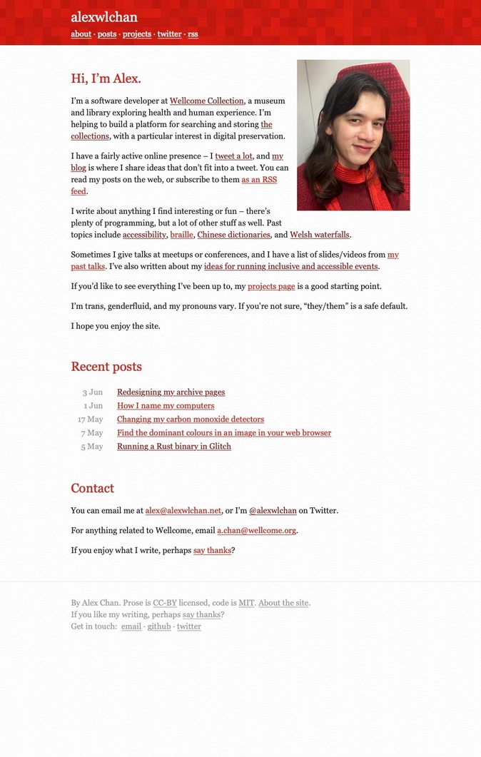
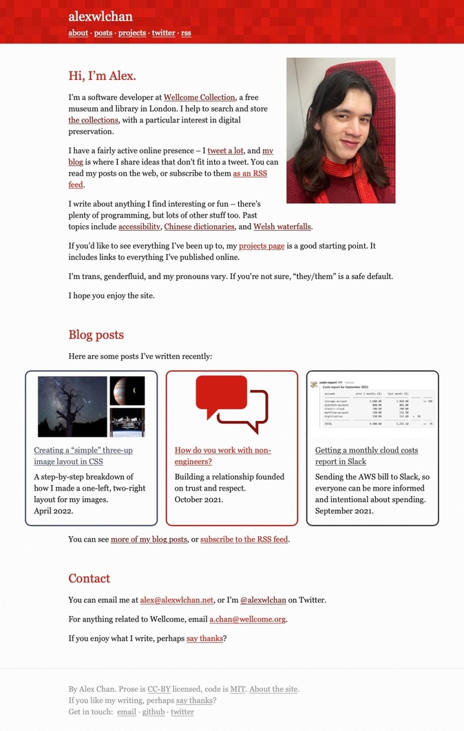
I think this is more visually appealing, and more likely to draw somebody into the blog. It also means longer, in-depth pieces will stick around, and they won’t be displaced so quickly.
Currently it’s pulling the 3–4 most recent “best of” posts. I can imagine at some point I might select them by hand, so there’s always a mix of programing and non-programming content, but that’s a decision for another day.
Avid readers can still see subscribe to the RSS feed if they want to get everything; this is meant for new readers who’ve never seen my blog before.
Designing for vibes
If this was a professional website or a serious source of income, I’d have some analytics or metrics to measure this new design. Are more people finding old posts? Are they spending more time on the site? Have I improved my bounce rate?
But this isn’t a professional site, it’s a hobby project where I write for fun – and I make design decisions based on ✨ vibes ✨.
I don’t have any analytics, and I don’t know if the redesign will improve my metrics. I do know it’ll make me more comfortable sending people to the blog, and I care about that more.
This was a fun project to work on. I went from initial prototype to live page in a day and a half (and I spent most of that time sleeping). I have ideas for more tweaks and changes, but already I think it’s a big improvement on what was there before.